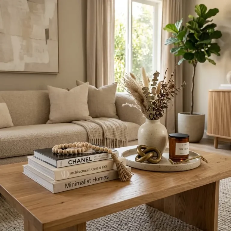
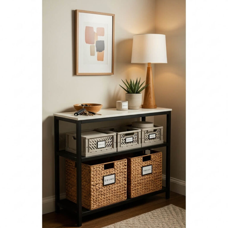
15 Designer-Approved Earthy Color Palettes For A Cozy Living Room Vibe
Earthy Color Palettes are color combinations inspired by nature, including warm beiges, soft creams, olive greens, terracotta, clay, taupe, rich browns, and muted grays. These palettes create a calming, welcoming atmosphere while adding timeless warmth, depth, and elegance to both modern and traditional living spaces.
Earthy Color Palettes For Cozy Living Rooms have become the secret behind some of today’s most inviting interiors. Inspired by nature, these soothing combinations of warm neutrals, rich greens, terracottas, and wood tones instantly make a space feel welcoming while remaining effortlessly stylish.
In this guide, you’ll discover 15 designer-approved color palettes, practical decorating ideas, and expert styling tips to help you create a cozy living room you’ll love coming home to.
1. Warm Beige, Soft White & Natural Oak (Earthy Color Palettes For Cozy Living Rooms)
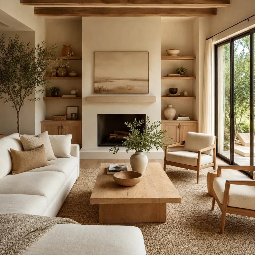
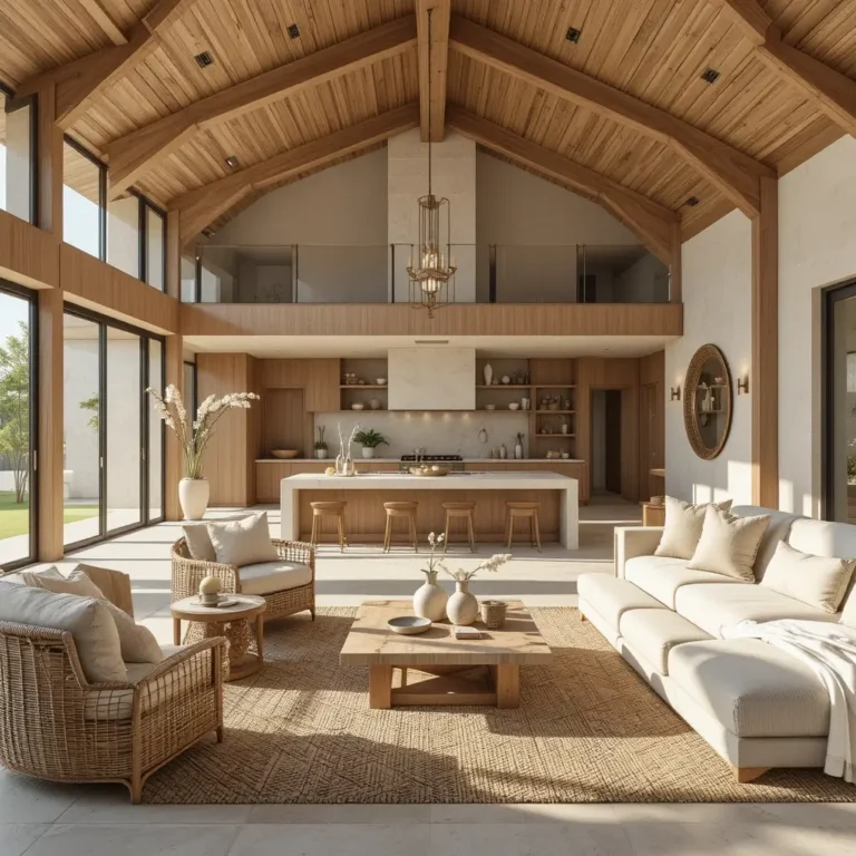
There’s a reason designers return to this palette year after year. Warm beige walls paired with crisp yet creamy whites create an airy foundation, while natural oak furniture introduces organic warmth that instantly makes the room feel lived in. The result is bright without feeling cold, making it ideal for homeowners who want a cozy atmosphere that still feels fresh and sophisticated.
Why Designers Love It
Professional designers often begin with warm neutrals because they provide incredible flexibility. Beige softens the space, white keeps everything feeling open, and oak introduces visual texture through its natural grain. Together, they create subtle contrast that never overwhelms the room, allowing furniture, artwork, and textiles to shine.
Best Furniture Pairings
Choose a linen sofa in ivory or oatmeal, an oak coffee table, boucle accent chairs, woven baskets, and a textured wool rug. Layer in light wood shelving and ceramic accessories to reinforce the organic feel. Finish with warm brass lighting for a soft evening glow.
Best Accent Colors
- Sage green
- Matte black
- Camel
- Warm caramel
- Olive branches
- Soft charcoal
Best For
- Scandinavian interiors
- Organic Modern homes
- Modern Farmhouse
- Minimalist living rooms
Designer Tip
Layer at least three different natural textures—linen, wood, and woven fibers—to create depth without relying on bold colors.
2. Olive Green, Cream & Walnut
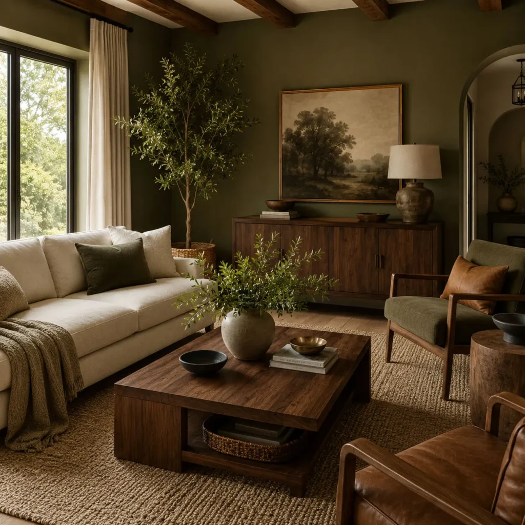
If you want your living room to feel grounded and effortlessly elegant, olive green deserves serious consideration. This rich botanical shade instantly connects indoor spaces with nature, while cream prevents the room from feeling too dark. Walnut furniture introduces richness that elevates the entire palette.
Why Designers Love It
Olive green acts almost like a neutral, pairing beautifully with warm woods and natural materials. Unlike brighter greens, it creates a relaxing atmosphere while remaining sophisticated throughout every season. Designers especially appreciate how this palette balances color with comfort.
Best Furniture Pairings
Select a cream performance-fabric sofa, walnut coffee table, leather accent chair, woven jute rug, and linen curtains. Complete the room with black metal floor lamps and handcrafted ceramic décor for a collected designer look.
Best Accent Colors
- Brass
- Rust
- Camel leather
- Warm ivory
- Black
- Deep forest green
Best For
- Rustic homes
- Organic Modern interiors
- Contemporary cottages
- Transitional spaces
Designer Tip
Bring in real plants to echo the olive tones naturally. Large leafy greenery softens the room while reinforcing the connection to nature.
3. Terracotta, Sand & Camel
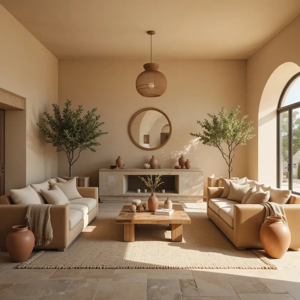
Warm, welcoming, and full of character, terracotta continues to dominate designer mood boards because it brings the comforting feeling of Mediterranean landscapes indoors. Balanced with soft sand and camel, it creates a palette that’s cozy without becoming overpowering.
Why Designers Love It
Terracotta introduces personality while still feeling timeless. Its earthy undertones complement wood furniture, natural stone, woven materials, and handcrafted pottery. Designers often use this palette when creating spaces that feel relaxed, layered, and full of warmth.
Best Furniture Pairings
Pair a sand-colored sofa with camel leather armchairs, reclaimed wood tables, woven pendant lighting, and textured throw blankets. Terracotta pottery, clay vases, and handcrafted ceramics complete the look beautifully.
Best Accent Colors
- Olive green
- Cream
- Matte black
- Burnt orange
- Natural wood
- Soft ivory
Best For
- Mediterranean interiors
- Boho living rooms
- Southwestern homes
- Rustic modern spaces
Designer Tip
Instead of painting every wall terracotta, use it strategically through an accent wall, decorative accessories, artwork, or upholstered furniture. This keeps the room warm while maintaining visual balance.
4. Soft Taupe, Charcoal & Linen (Earthy Color Palettes For Cozy Living Rooms)
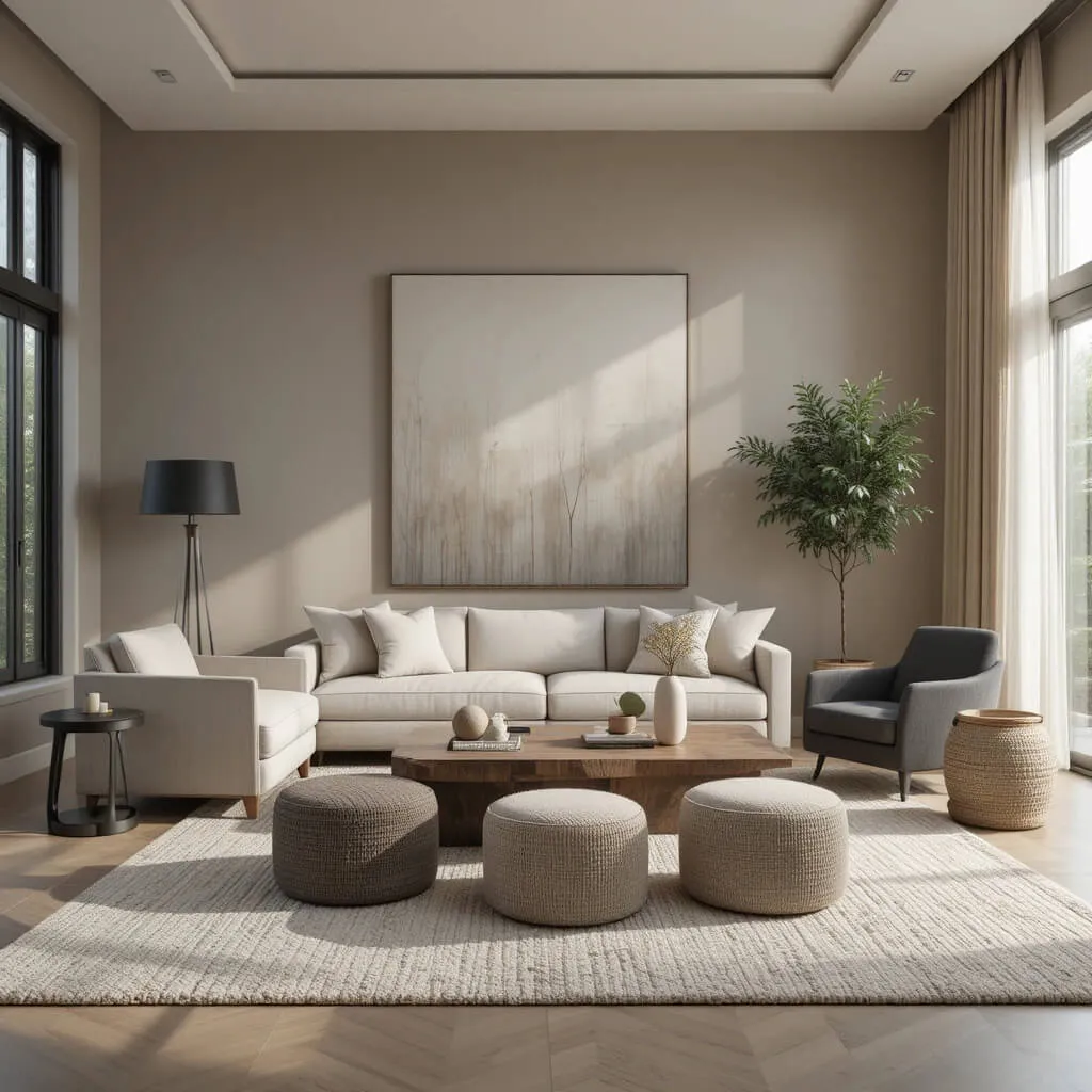
If you’re looking for a palette that feels refined yet incredibly inviting, soft taupe, charcoal, and linen are a winning combination. Taupe offers the perfect balance between beige and gray, while charcoal adds sophisticated depth without overpowering the space. Linen tones soften the contrast, resulting in a living room that feels polished, cozy, and effortlessly timeless.
Why Designers Love It
Designers often rely on taupe because it’s one of the most versatile neutrals available. It adapts beautifully to changing light throughout the day and pairs effortlessly with both warm and cool materials. Charcoal grounds the palette with just enough contrast, while linen introduces brightness and texture. Together, they create a layered look that feels elegant rather than stark.
Best Furniture Pairings
Choose a linen slipcovered sofa, a charcoal upholstered accent chair, and a reclaimed oak or walnut coffee table. Add a textured wool area rug, boucle ottomans, and matte black lighting for subtle contrast. Complete the look with woven baskets, stone accessories, and oversized neutral artwork to reinforce the calming aesthetic.
Best Accent Colors
- Warm ivory
- Antique brass
- Olive green
- Espresso brown
- Matte black
- Dusty sage
Best For
- Contemporary homes
- Transitional interiors
- Modern luxury spaces
- Minimalist living rooms
Designer Tip
Mix several shades of taupe throughout the room rather than matching everything exactly. Varying the tone in pillows, curtains, rugs, and upholstery creates a professionally layered look that feels warm and intentional.
5. Sage Green, Warm White & Light Wood (Earthy Color Palettes For Cozy Living Rooms)
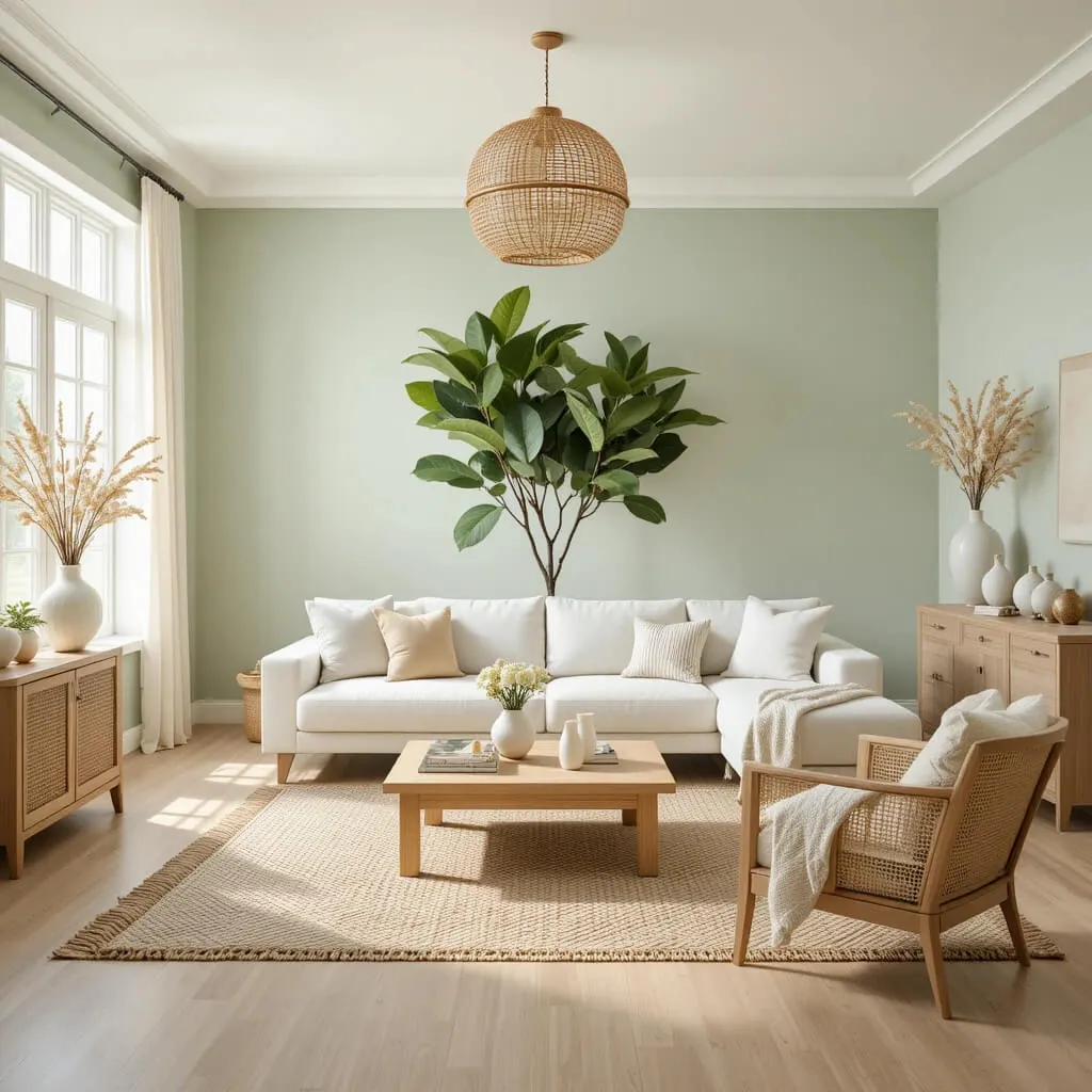
Few combinations capture a sense of calm quite like sage green paired with warm white and light wood finishes. Inspired by nature, this palette creates a peaceful retreat that feels fresh, airy, and welcoming. It’s an excellent choice for homeowners who want color without sacrificing the clean, timeless appeal of neutral interiors.
Why Designers Love It
Sage green has become a designer favorite because of its remarkable versatility. Unlike brighter greens that can dominate a room, sage acts as a soft neutral, blending beautifully with natural wood, stone, woven textures, and white walls. It creates visual interest while maintaining a soothing atmosphere that encourages relaxation.
Best Furniture Pairings
Opt for a warm white sofa with light oak coffee and side tables. Incorporate cane-front cabinets, boucle accent chairs, woven pendant lights, and a natural jute rug. Linen curtains, handcrafted ceramic vases, and textured knit throws complete the inviting look while adding depth through tactile materials.
Best Accent Colors
- Terracotta
- Soft beige
- Cream
- Warm brass
- Muted olive
- Natural oak
Best For
- Japandi interiors
- Scandinavian homes
- Organic Modern designs
- Cottage-inspired living rooms
Designer Tip
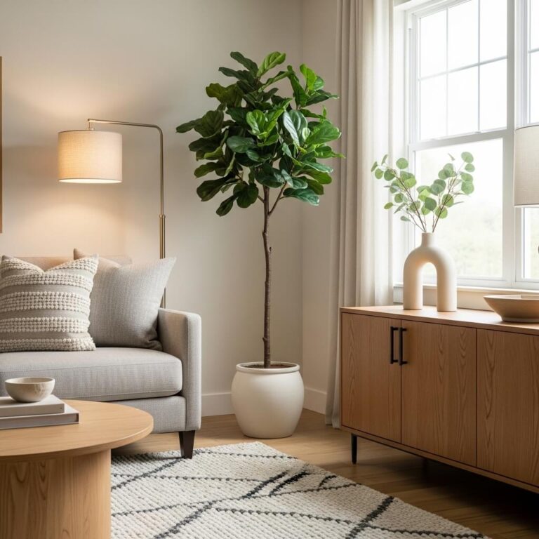
Layer greenery in different sizes throughout the room. A large fiddle-leaf fig, smaller potted herbs, and trailing plants reinforce the natural palette while making the space feel alive and effortlessly curated.
Why Earthy Color Palettes Never Go Out of Style
One of the biggest reasons designers continue recommending Earthy Color Palettes For Cozy Living Rooms is their timeless versatility. Unlike trend-driven colors that quickly lose popularity, earthy hues are rooted in nature, making them feel familiar and comforting year after year. They also adapt beautifully to changing décor styles. Whether your taste evolves toward Scandinavian simplicity, Organic Modern warmth, Modern Farmhouse charm, or contemporary luxury, an earthy foundation allows you to refresh your space simply by swapping pillows, artwork, throws, or decorative accessories instead of repainting the entire room.
Another major advantage is their ability to enhance natural light. Warm neutrals, muted greens, clay tones, and soft browns reflect light gently, creating interiors that feel brighter during the day and cozier in the evening. This balance makes earthy palettes an investment in both style and comfort—one that continues to pay off for years to come.
6. Clay, Ivory & Dark Wood (Earthy Color Palettes For Cozy Living Rooms)
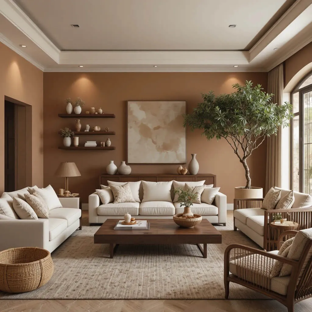
Clay is one of those colors that instantly makes a room feel welcoming. Richer than beige but softer than terracotta, it introduces warmth without overwhelming the space. When balanced with creamy ivory walls and dark wood furniture, this palette creates a living room that feels sophisticated, grounded, and full of character.
Designers love using clay because it reflects the beauty of natural landscapes. It pairs effortlessly with handcrafted ceramics, woven baskets, linen fabrics, and vintage-inspired décor, creating a space that feels thoughtfully collected instead of perfectly matched.
A plush ivory sofa becomes the perfect canvas for clay-colored pillows and textured throws. Dark walnut coffee tables, floating shelves, or exposed ceiling beams anchor the room, while soft lighting enhances the warm undertones throughout the space. Layering natural materials such as rattan, travertine, and jute keeps the palette feeling organic rather than heavy.
For added interest, incorporate olive green plants, antique brass accents, and handmade pottery. These subtle details echo the earthy theme while preventing the room from feeling one-dimensional.
Designer Tip: Choose clay-colored accessories if you’re hesitant to paint your walls. Cushions, artwork, and decorative ceramics offer the same inviting warmth with much less commitment.
7. Mushroom Brown, Cream & Matte Black
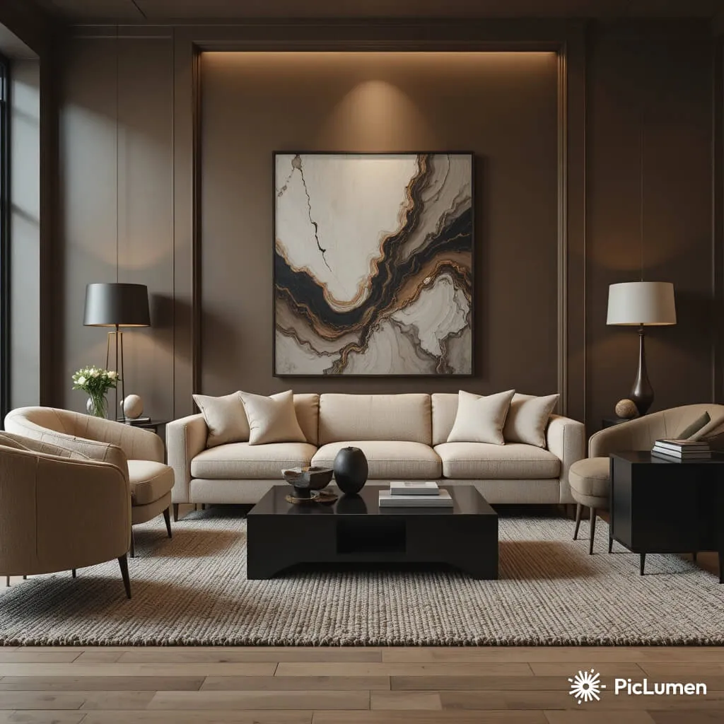
Mushroom brown has quietly become one of the most sought-after designer neutrals. Its soft gray-brown undertones create warmth while maintaining a contemporary edge, making it an ideal foundation for homeowners who want a cozy living room without relying on traditional beige.
Cream softens the palette and keeps the room bright, while matte black accents provide just enough contrast to define the space. Together, these colors create a balanced interior that feels both elegant and comfortable.
Furniture with rounded silhouettes works particularly well here. Think oversized cream sofas, curved accent chairs, light oak side tables, and black-framed coffee tables. Textured boucle upholstery, chunky knit throws, and linen curtains add layers that invite you to relax.
Natural stone accessories, oversized abstract artwork, and warm LED lighting complete the look while maintaining the palette’s understated sophistication.
Designer Tip: Instead of using black extensively, repeat small black accents throughout the room—picture frames, lamp bases, cabinet hardware, and candle holders—to create visual rhythm without making the space feel dark.
8. Dusty Olive, Beige & Warm Brass
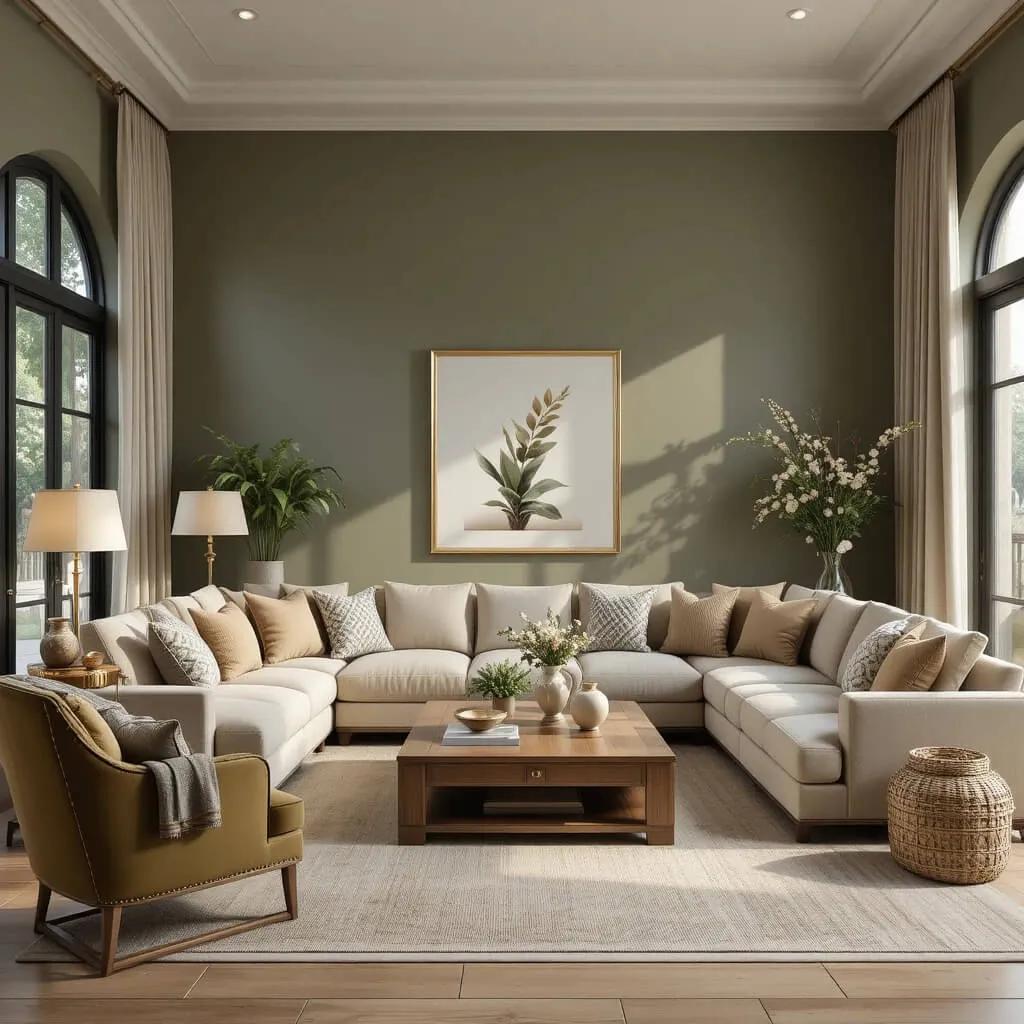
For homeowners looking to introduce a little more color while preserving a cozy atmosphere, dusty olive is an excellent choice. This muted green feels timeless rather than trendy and works beautifully with warm beige walls and elegant brass accents.
The combination strikes a perfect balance between earthy comfort and refined luxury. Designers often choose this palette because it adapts seamlessly to changing seasons. In spring and summer, it feels fresh and natural. During autumn and winter, layered textiles transform it into an incredibly warm retreat.
Consider a beige sectional paired with olive velvet accent chairs, brass floor lamps, and a solid oak coffee table. Linen drapes, woven baskets, and textured cushions introduce softness while maintaining the organic aesthetic.
Accessories in aged brass bring subtle warmth without appearing overly glamorous. A few carefully chosen ceramic vases, framed botanical prints, and leafy indoor plants reinforce the nature-inspired theme.
Designer Tip: Velvet is one of the easiest ways to elevate earthy palettes. Even a single olive velvet chair can make the entire room feel professionally designed.
9. Cinnamon Brown, Greige & Soft White
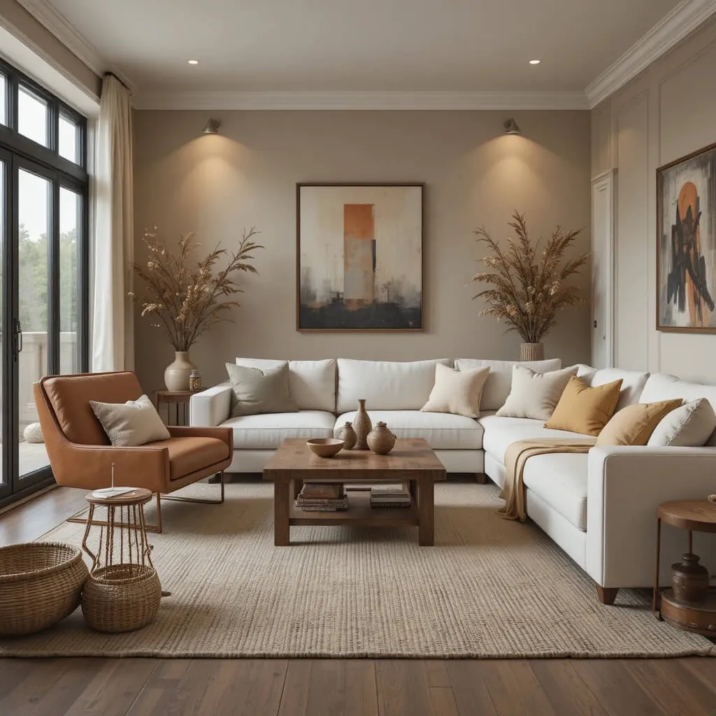
Cinnamon brown offers a richer alternative to traditional neutral palettes. It adds depth and warmth while maintaining an approachable, lived-in feel that’s perfect for family living rooms.
Greige—a blend of gray and beige—helps balance cinnamon’s richness, while soft white prevents the room from feeling enclosed. This combination creates an inviting environment that’s equally suited to modern and traditional interiors.
Designers often incorporate leather furniture into this palette because the natural patina develops beautifully over time. Pair a cinnamon leather chair with a greige sofa, reclaimed wood coffee table, and textured cream rug for a space that’s equal parts comfortable and sophisticated.
Layering different shades of brown through baskets, woven trays, wood frames, and linen textiles creates depth without introducing unnecessary color.
Designer Tip: Use warm white bulbs throughout the room. Cooler lighting can flatten earthy tones, while warm lighting enhances their richness and makes the space feel noticeably cozier.
10. Cocoa Brown, Soft Taupe & Natural Stone
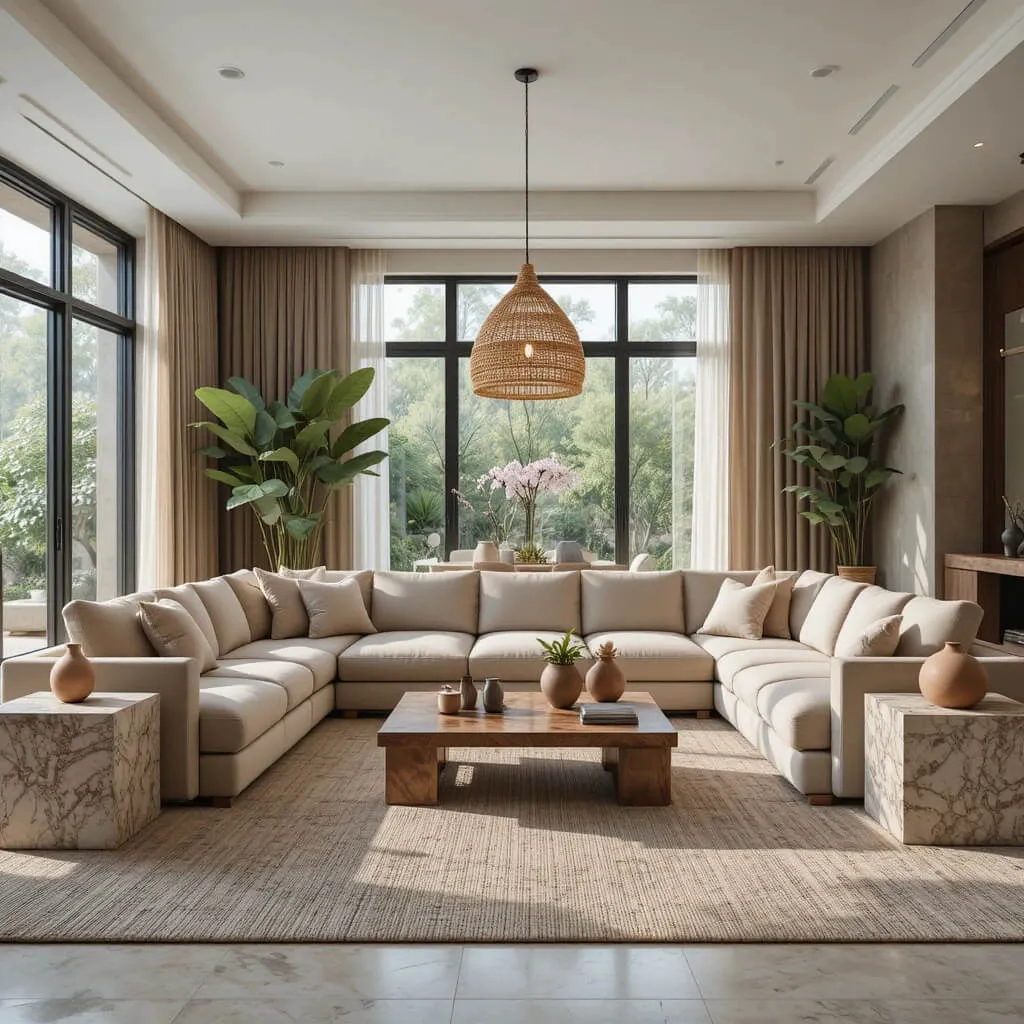
If your goal is creating a luxurious yet relaxing living room, cocoa brown, soft taupe, and natural stone are a designer-approved combination worth considering. This palette feels rich without becoming dramatic and works beautifully in both large open-plan spaces and smaller living rooms.
Cocoa brown provides depth, taupe softens the overall appearance, and stone-inspired elements introduce natural variation that keeps the room visually interesting.
Choose upholstered seating in soft taupe, then anchor the space with a cocoa-colored coffee table or built-in shelving. Travertine side tables, marble accessories, textured wool rugs, and linen curtains reinforce the palette’s organic elegance.
Finish the room with oversized greenery, handcrafted pottery, and woven pendant lighting to create an atmosphere that feels curated rather than decorated.
Designer Tip: Keep the color palette restrained and let texture do the work. Combining boucle, linen, leather, natural wood, stone, and woven fibers creates a designer look that’s warm, sophisticated, and timeless.
11. Sandstone, Olive & Cognac Leather
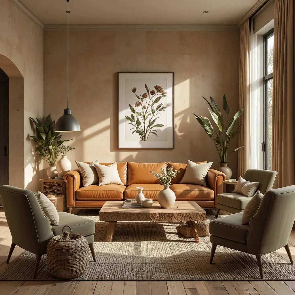
There’s something effortlessly inviting about the combination of sandstone, olive, and cognac leather. Inspired by rugged landscapes and natural materials, this palette creates a living room that feels both sophisticated and comfortably lived-in. It strikes a beautiful balance between warmth and freshness, making it an excellent choice for homeowners who want timeless style without sacrificing personality.
Soft sandstone walls provide a light, neutral backdrop that reflects natural light beautifully throughout the day. Olive green introduces a calming, organic touch, whether through an accent wall, upholstered chairs, or decorative accessories. Cognac leather, meanwhile, adds richness and character that only improves with age, developing a beautiful patina over time.
To complete the look, incorporate reclaimed wood furniture, woven baskets, linen curtains, and textured area rugs. Black metal lighting fixtures add subtle definition, while handcrafted pottery and botanical artwork reinforce the palette’s connection to nature.
This combination feels especially welcoming during every season. In spring and summer, the olive accents feel fresh and vibrant. During autumn and winter, leather, wood, and warm textiles transform the room into a cozy retreat perfect for relaxing evenings.
Designer Tip: Leather looks best when paired with plenty of soft textures. Balance its smooth finish with boucle pillows, chunky knit throws, and woven rugs to create a room that feels layered rather than overly polished.
12. Warm Gray, Natural Wood & Cream
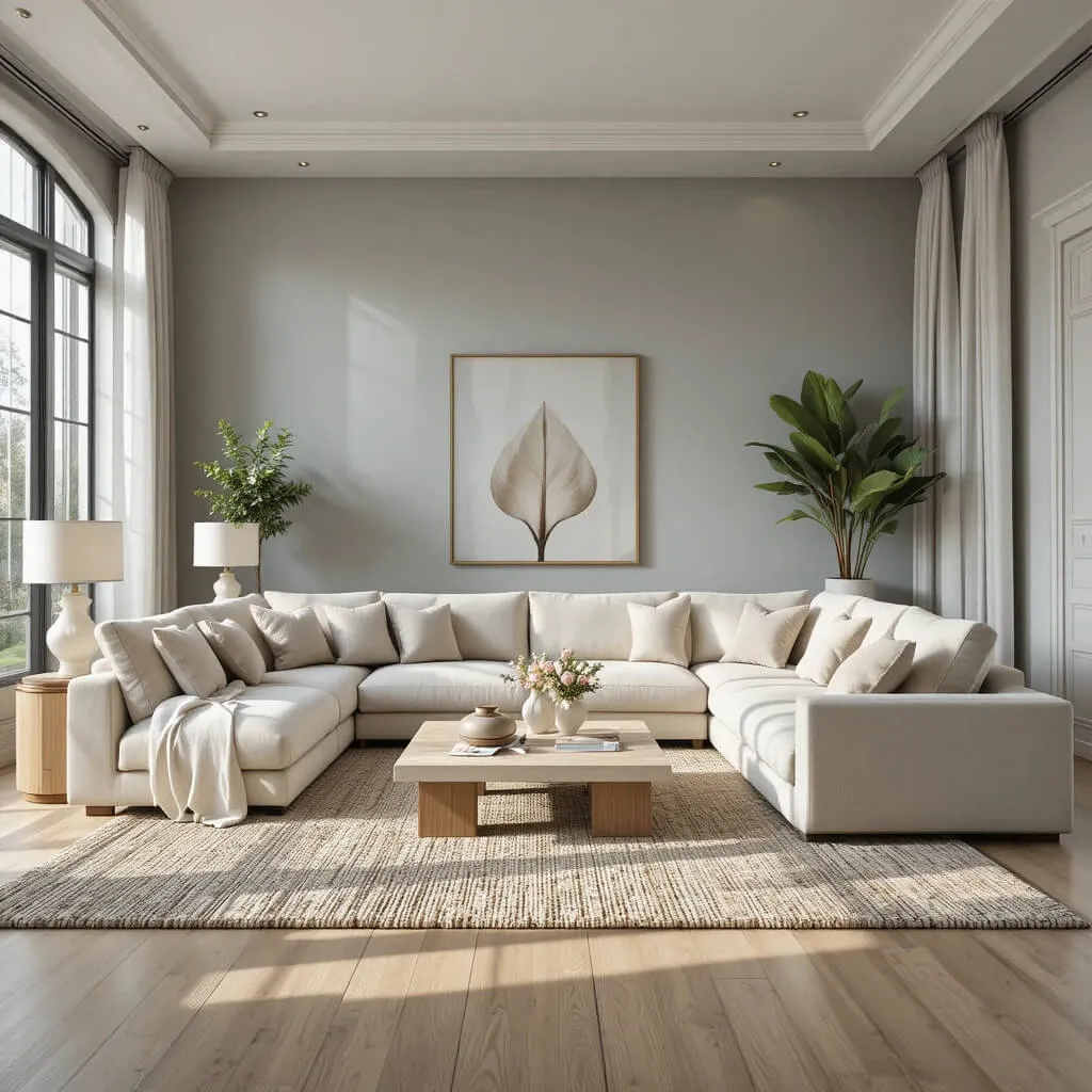
Warm gray has evolved into one of today’s most versatile neutral colors. Unlike cooler grays that can sometimes feel stark, warm gray carries subtle beige undertones that create a cozy, welcoming atmosphere. Combined with natural wood and creamy whites, it forms an elegant palette that suits both classic and contemporary interiors.
Designers often recommend this combination because it allows architectural details and carefully chosen furnishings to become the focal point. Rather than competing for attention, each color quietly complements the others, creating harmony throughout the room.
A cream sectional paired with white oak furniture instantly brightens the space, while warm gray walls provide gentle contrast. Layer in linen curtains, wool rugs, ceramic lamps, and textured cushions to add visual interest without introducing unnecessary colors.
Natural greenery is particularly effective within this palette. A large fiddle-leaf fig or olive tree instantly softens the room while reinforcing the organic aesthetic. Finish with brushed brass lighting and minimalist artwork for a clean yet inviting appearance.
This palette works beautifully in open-concept homes because it flows naturally into adjoining dining rooms, kitchens, and hallways without feeling repetitive.
Designer Tip: Incorporate multiple wood tones instead of matching every furniture piece. Mixing light oak with medium walnut creates a professionally curated look that feels authentic and collected over time.
13. Rust, Beige & Honey Oak
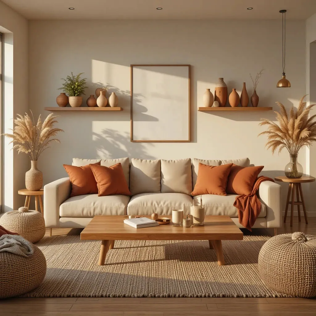
If you’re searching for a palette that feels warm, cheerful, and full of personality, rust paired with beige and honey oak delivers exceptional results. Rust offers the perfect middle ground between bold terracotta and understated brown, bringing warmth that instantly makes a living room feel welcoming.
Beige keeps the room balanced by softening rust’s richness, while honey oak introduces natural brightness that prevents the palette from becoming too heavy. Together, these colors create an inviting environment that feels equally suited to entertaining guests or enjoying a quiet evening at home.
An oversized beige sofa serves as the ideal foundation, layered with rust-colored cushions, textured throws, and patterned area rugs featuring subtle earth tones. Honey oak coffee tables, floating shelves, and media units reinforce the palette’s natural warmth.
Decorative accessories such as woven baskets, terracotta planters, dried pampas grass, handcrafted ceramics, and landscape artwork complete the look while maintaining a relaxed designer aesthetic. Soft ambient lighting enhances the warm undertones, making the room feel even more comfortable after sunset.
This palette pairs beautifully with organic modern, modern farmhouse, Mediterranean, and contemporary rustic interiors, proving that earthy colors can feel both timeless and current.
Designer Tip: Repeat rust throughout the room in small doses instead of relying on one large statement piece. Pillows, artwork, ceramics, and decorative throws help distribute the color evenly, creating balance while adding depth and visual interest.
14. Mocha, Linen & Olive
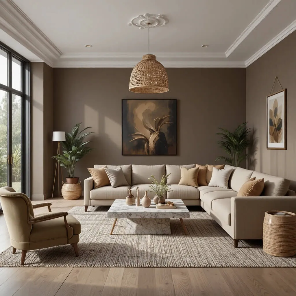
Mocha has emerged as one of the most elegant earthy neutrals in contemporary interior design. Rich without feeling overwhelming, it creates a sense of comfort and sophistication that instantly elevates a living room. When paired with soft linen tones and muted olive accents, the result is a balanced palette that feels warm, inviting, and effortlessly stylish.
Designers appreciate mocha because it adds depth while remaining incredibly versatile. It works beautifully on walls, upholstered furniture, or wood finishes and pairs seamlessly with natural materials such as oak, rattan, travertine, and linen. Soft linen upholstery keeps the room feeling bright, while olive accents introduce just enough color to reinforce the connection to nature.
Complete the space with woven pendant lighting, handcrafted ceramics, textured wool rugs, and layered throw blankets. A few carefully placed indoor plants add freshness without overwhelming the neutral foundation. The overall effect is a cozy living room that feels luxurious yet relaxed.
Designer Tip: Incorporate varying shades of mocha throughout the room instead of relying on a single tone. Layering light and dark browns creates depth while maintaining a cohesive, professionally designed appearance.
15. Forest Green, Warm Beige & Walnut
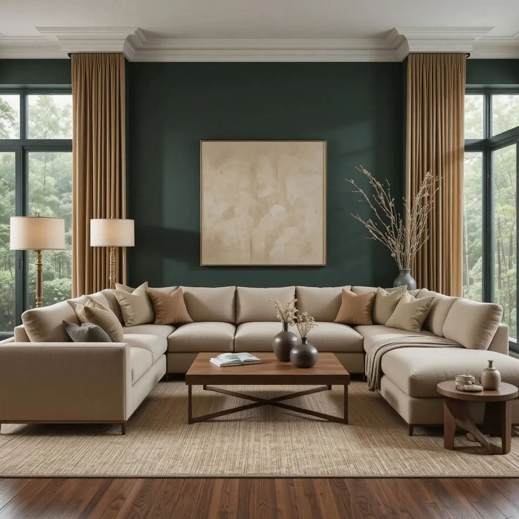
For homeowners who want to make a bold yet timeless statement, forest green paired with warm beige and walnut offers the perfect combination. Rich green walls create a dramatic backdrop while warm beige softens the overall look, preventing the room from feeling too dark. Walnut furniture introduces natural warmth that ties the entire palette together beautifully.
This combination works especially well in living rooms with abundant natural light, where the changing sunlight highlights the depth and complexity of the green throughout the day. Plush beige seating, walnut coffee tables, brass lighting, and natural fiber rugs complete the look while maintaining a cozy atmosphere.
Layer the room with velvet cushions, linen curtains, textured artwork, and handcrafted pottery to create a collected, designer-inspired aesthetic. Whether your home leans toward Organic Modern, Traditional, or Contemporary, this palette delivers warmth and sophistication that never goes out of style.
Designer Tip: If painting every wall feels too bold, use forest green on a feature wall or built-in shelving while keeping the remaining walls warm beige for a balanced, inviting look.
Frequently Asked Questions
1. What colors make a living room feel cozy?
Warm neutrals such as beige, cream, taupe, clay, terracotta, olive green, sage, and soft browns are among the best colors for creating a cozy living room. These earthy tones mimic nature, soften the space, and pair beautifully with wood furniture, textured fabrics, and warm lighting to create a welcoming atmosphere.
2. Are earthy color palettes still in style?
Absolutely. Earthy color palettes continue to be one of the biggest interior design trends because they offer timeless appeal rather than following short-lived fads. Designers value them for their versatility, ability to complement natural materials, and effortless compatibility with decorating styles ranging from Scandinavian and Japandi to Modern Farmhouse and Organic Modern.
3. Which earthy paint color works best in a small living room?
Soft shades like warm beige, creamy white, sage green, light taupe, and sandstone are excellent choices for smaller living rooms. These colors reflect natural light, helping the room feel brighter and more spacious while still delivering the warmth and comfort associated with earthy interiors.
4. Can earthy colors work in modern homes?
Yes. Earthy palettes are incredibly versatile and work beautifully in modern interiors. Pair clean-lined furniture with warm wood finishes, textured fabrics, matte black accents, and minimalist décor to achieve a contemporary look that feels sophisticated, inviting, and timeless.
5. How do I decorate with earth tones without making the room feel dark?
The key is balance. Combine deeper shades like walnut, olive, cocoa, or forest green with lighter colors such as cream, linen, warm white, or beige. Incorporate mirrors, layered lighting, natural textures, and plenty of greenery to keep the room feeling open, bright, and welcoming.
Conclusion
Earthy Color Palettes For Cozy Living Rooms prove that comfort and style can go hand in hand. Whether you’re drawn to calming sage greens, warm terracottas, timeless beiges, or dramatic forest greens, these designer-approved combinations create living spaces that feel welcoming every day of the year.
Start with a palette that reflects your personality, layer in natural textures, and don’t be afraid to mix materials for added depth. With thoughtful styling, your living room can become the cozy retreat you’ve always imagined.
Which of these earthy color palettes is your favorite? Let us know in the comments we’d love to hear how you’re bringing nature-inspired warmth into your home.