16 Bright Spring outfits To Rock This Season
Your Seasonal Color Analysis Cheat Sheet for That Dopamine-Dressing Energy
Okay, real talk: You just got your color analysis done, the consultant handed you that fan deck, and now you’re standing in front of your closet thinking, “Cool. So… what do I actually wear?”
I’ve been there. When I first discovered I was a Bright Spring, I thought my only options were traffic-cone orange and highlighter yellow. Spoiler alert: I was very wrong.
Bright Spring sits right at the intersection of warm and cool—it’s the season that refuses to be boxed in. You need clarity, saturation, and contrast. Pastels? Nope. Muted earth tones? Please. You need colors that punch first and ask questions later.
So grab your coffee (or iced latte, because Bright Springs don’t do beige beverages), and let’s build your new favorite palettes. I’m giving you 16 combos that actually work IRL.
1. Coral Reef & Turquoise Tide

This is the palette that makes people assume you live in Bali. It’s warm-leaning coral paired with a clean, blue-based turquoise. Together, they create that “I woke up like this” energy—except you absolutely did not wake up like this, and that’s fine.
Pro Tip: Wear the coral on top (near your face) and the turquoise on the bottom. It brings out the natural flush in your cheeks without you actually having to exercise.
2. Emerald City & Hot Pink
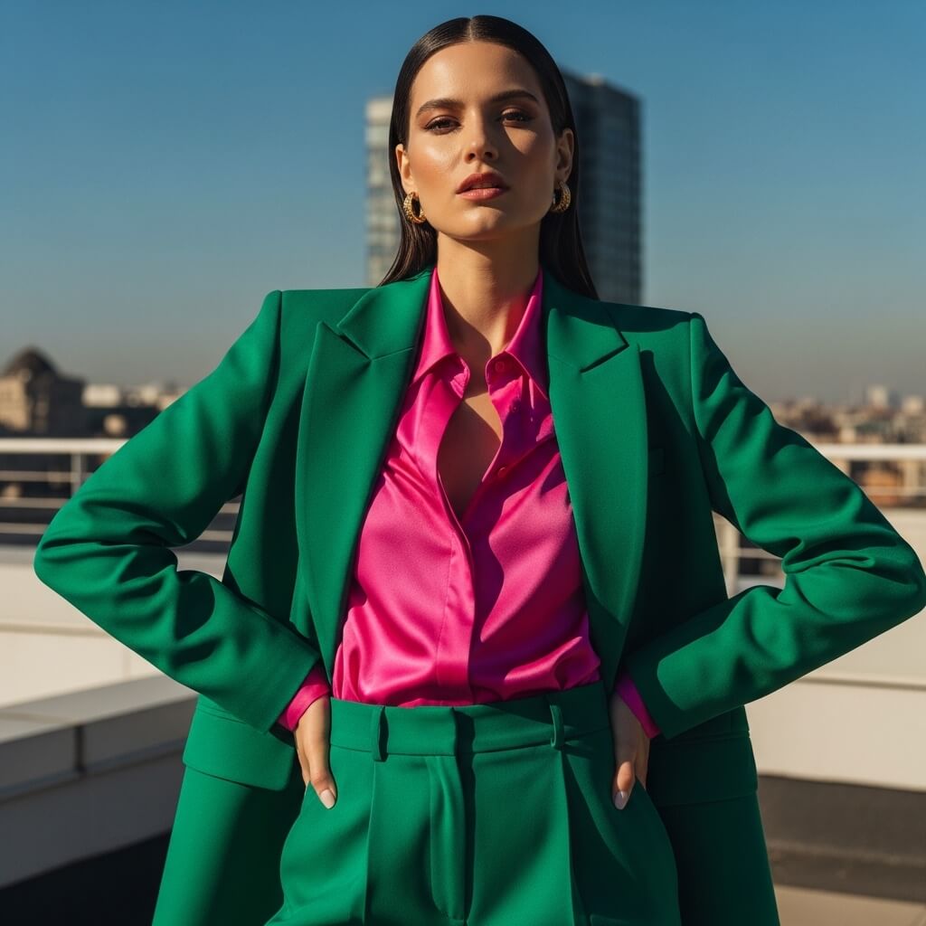
Picture this: You have a job interview, a date, or—I don’t know—an audition to become a Disney villain. This is your power couple. Emerald green provides the grounding, while hot pink screams confidence.
Personal Take: I wore this combo to a networking event last year. Three people asked if I was “someone important.” I wasn’t. But the colors lied for me.
3. True Red & Cobalt Blue
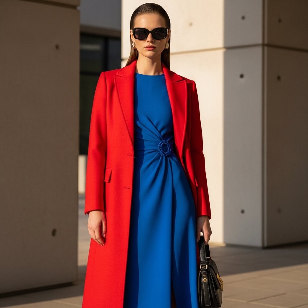
Red and blue can look like a patriotic explosion if you’re not careful. But Bright Spring versions? They sit at full saturation. Think classic Hermès orange-red paired with a cobalt that’s almost electric.
Downside: You will be visible from space. If subtlety is your goal, maybe look away.
4. Lemon Sorbet & Lilac
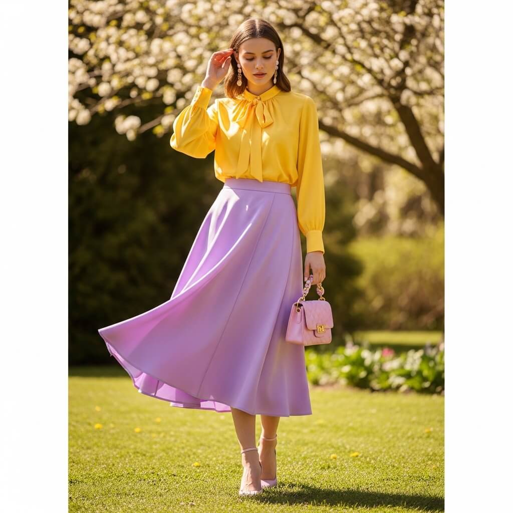
Ever wondered why some pastels work for Bright Springs while others wash us out? It’s the clarity. These aren’t dusty, muted pastels—they’re clean, almost neon-adjacent. Lemon yellow and lilac create a high-contrast, soft-yet-loud vibe.
Story Time: I once told a friend this palette reminded me of “fairy tale candy.” She said I looked like a Starburst wrapper. I took it as a compliment.
5. Bright Aqua & Chocolate Brown
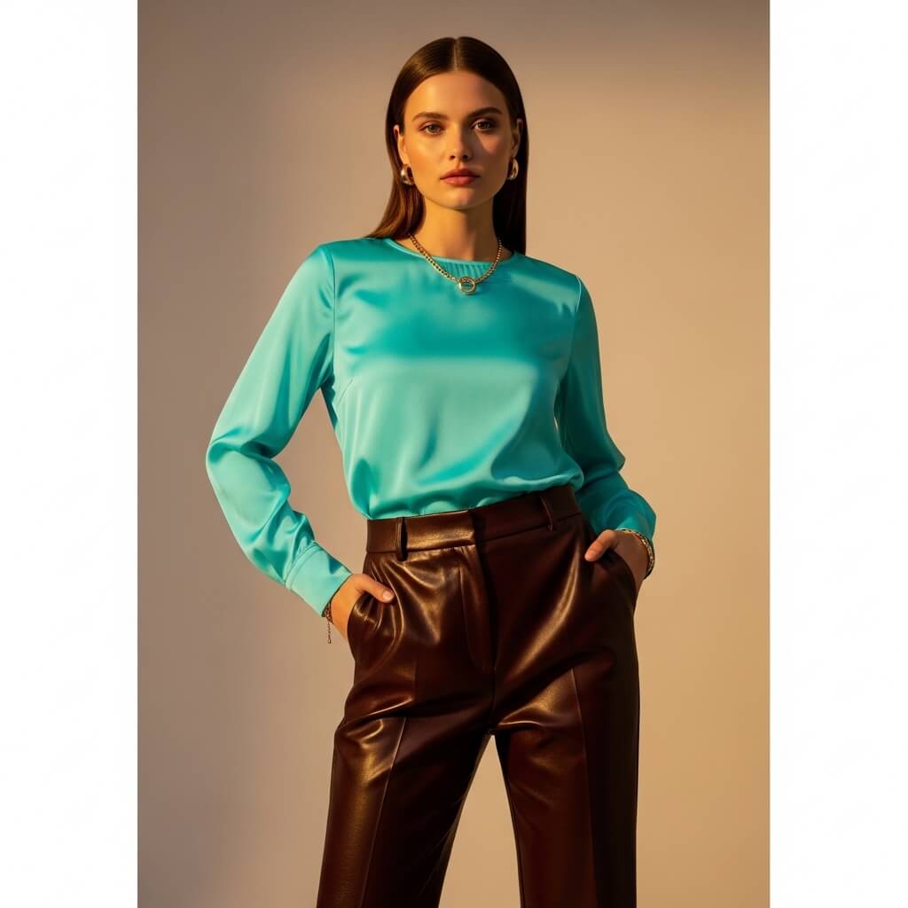
Brown? For a Bright Spring? I know, I know—it sounds like a violation. But here’s the secret: deep, rich chocolate brown isn’t the same as beige or taupe. When you pair it with bright aqua, the brown acts as an anchor. Suddenly the aqua glows instead of screams.
Pro Move: Use the brown as your pant or shoe color. Keep the aqua near your face. Trust me on this.
6. Fuchsia & Lime Green
If this combo doesn’t make you smile, check your pulse. Seriously. Fuchsia and lime green are the official colors of “I don’t play it safe.” They’re complementary on the color wheel, which means they technically match, but they feel rebellious.
Rhetorical Question: Why do we spend so much time trying to look “mature” when we could just look this joyful?
7. Royal Purple & Golden Yellow

This is the palette for when you have a presentation, a pitch, or a confrontation with your landlord. Royal purple commands respect; golden yellow says, “And I’m fun, too.” Balance the cool purple with the warm yellow, and you’ve got instant authority without the boring black blazer.
Personal Fave: I own a purple sheath dress that I literally only bought because I knew this yellow bag existed.
8. Electric Blue & Mandarin Orange

Blue and orange are opposites on the color wheel, which means they create maximum visual vibration. This isn’t a whisper—it’s a shout. But because both colors are fully saturated, they read as intentional, not accidental.
Pro Tip: Use 70/30 distribution. Let one color dominate. Otherwise you look like a sports team mascot.
9. Parakeet Green & Soft White
Sometimes you need a break from all that intensity. Enter parakeet green—it’s bright, but it’s also fresh and airy. Pair it with a soft, warm white (not stark hospital white), and suddenly you look expensive.
Downside: Soft white shows coffee stains immediately. I learned this the hard way. Twice.
10. Magenta & Teal

Magenta leans cool; teal leans warm. Together, they create that “what season are you, even?” ambiguity that makes Bright Spring so fun to dress. You’re not strictly warm. You’re not strictly cool. You’re just… bright.
Personal Take: I own a teal blazer specifically because it makes every magenta top I own look intentional. It’s my style cheat code.
11. Bright Periwinkle & Warm Gray

Periwinkle often gets dismissed as “grandma’s bathroom tile.” But bright periwinkle—the kind with visible blue-violet saturation—is totally different. Pair it with a warm, light gray, and you get a work-appropriate palette that still respects your Bright Spring need for clarity.
Pro Move: Gray is tricky for us. Avoid cool grays (they make us look jaundiced). Always check the undertone.
12. Vivid Violet & Chartreuse
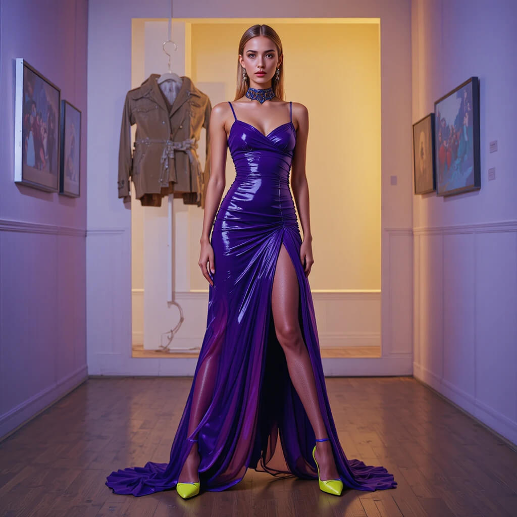
Okay, this one’s not for the faint of heart. Vivid violet and chartreuse are both aggressive, both loud, and both perfect for each other. It’s the color equivalent of punk rock.
Story Time: I wore this to a wedding once. The bride loved it. Her mother did not. I still consider it a win.
13. True Navy & Clear Red
Navy is usually a Dark Winter or Soft Summer color. But true navy—the kind that’s almost royal—works for Bright Springs because it has enough saturation to hold its own. Pair it with clear, primary red, and you’ve got a classic combo that doesn’t fade into the background.
Personal Fave: This is my “I want to look put-together but I’m actually running on three hours of sleep” palette.
14. Apple Green & Bright Cobalt
Apple green is warmer than emerald but cooler than lime. It sits in that perfect Bright Spring sweet spot. Throw in some bright cobalt, and you’ve got a palette that reads as both playful and sophisticated.
Rhetorical Question: Why do we assume “sophisticated” has to mean “muted”? I’m not buying it.
15. Hot Coral & Deep Teal

Coral again? Yes. Coral again. It’s basically a Bright Spring neutral at this point. But when you pair hot coral with deep teal, something magical happens. The teal cools down the coral just enough to keep it from screaming, while the coral warms up the teal so it doesn’t feel aloof.
Pro Tip: This is a phenomenal date night combo. Romantic, confident, and slightly unexpected.
16. Sunshine Yellow & Crisp Black

Black is usually off-limits for Bright Springs. It’s too heavy, too draining, too… goth. But when you pair crisp, clean black with a high-saturation sunshine yellow, the contrast is so sharp that it actually works.
Downside: This only works if the yellow is aggressively bright. If your yellow is even slightly muted, the black will eat you alive. Proceed with caution.
Wait—Did I Forget Something?
Oh right. You.
Listen: These palettes are guidelines, not laws. I can sit here and tell you that “Bright Springs should never wear X,” but at the end of the day, you’re the one wearing the clothes. If you try on coral and teal and feel like a million bucks, wear it. If you try on fuchsia and lime and feel like a clown, donate it.
Color analysis is a tool, not a cage.
Your Closet Is About to Get Very Loud (And That’s a Good Thing)
So here’s what we covered: 16 palettes, zero apologies, and one very important truth—Bright Spring isn’t about following rules. It’s about honoring your natural contrast and saturation so your clothes work with you, not against you.
FYI, I still own a few muted sweaters. They live in the back of my closet, collecting dust, and I wear them only when I’m doing laundry. Nobody’s perfect.
Now go raid your wardrobe. Try those coral-and-turquoise combos. Experiment with that lime green you’ve been side-eyeing. And when someone asks, “Isn’t that a little bright?” just smile and say, “Yeah. That’s the point.”
Got a favorite palette I didn’t list? Scream at me in the comments. I genuinely want to hear it.