Color Psychology in Interiors: How to Choose the Perfect Palette
Ever walked into a room and instantly felt calmer… or strangely energized… or even a little stressed without knowing why? Yep that’s the magic (and sometimes mischief) of color psychology at work. Colors aren’t just pretty pigments on a wall; they’re tiny emotional puppeteers pulling your mood-strings every single day.
And the wild part?
Most of us choose paint colors based on vibes, Pinterest pins, or that one shade your friend swears “looks amazing in all lighting.”
But when you truly understand color psychology in interiors, choosing your perfect home palette becomes easier, more intentional, and yes way more fun.
In this long-form, aesthetic-filled guide, we’re diving deep into:
✨ How colors affect your mood
✨ What each color really means in home decor
✨ How to choose a room-by-room palette
✨ Mistakes to avoid (goodbye, accidental neon nightmare!)
✨ Expert styling tips you can use today
Grab your iced coffee (or wine — zero judgment). Let’s curate a palette that feels like home.
Why Color Psychology Matters in Interior Design
Okay, before we dive into the rainbow, let’s get one thing straight: color isn’t just decorative — it’s emotional.
Every color has a psychological impact on the brain. Some soothe. Some excite. Some scream “I am bold and fearless!” while others whisper, “Let’s stay home and nap.”
Here’s what color psychology helps you do:
- Create a mood for each room
- Improve flow and harmony
- Express your personality
- Boost mental wellness
- Make your home feel intentionally designed
When your palette is aligned with your lifestyle and emotional needs, your home becomes more than stylish — it becomes supportive.
The Basics – Understanding the Color Wheel Like a Pro
Before you start picking swatches, let’s break down the three core categories of colors:
1. Warm Colors
Think: reds, oranges, yellows
These tones bring energy, positivity, and warmth. Perfect for spaces where you want movement or conversation.
2. Cool Colors
Think: blues, greens, purples
These create a calming, soothing vibe — ideal for relaxation and grounding.
3. Neutrals
Think: whites, creams, taupes, beiges, grays, blacks
Neutrals are your foundation — the quiet backbone of a modern, Pinterest-chic home.
Understanding how these categories behave is your secret weapon for creating a cohesive palette.
Color Psychology Explained — What Every Color Means in Home Decor
Let’s decode the emotional blueprint behind each color, shall we?
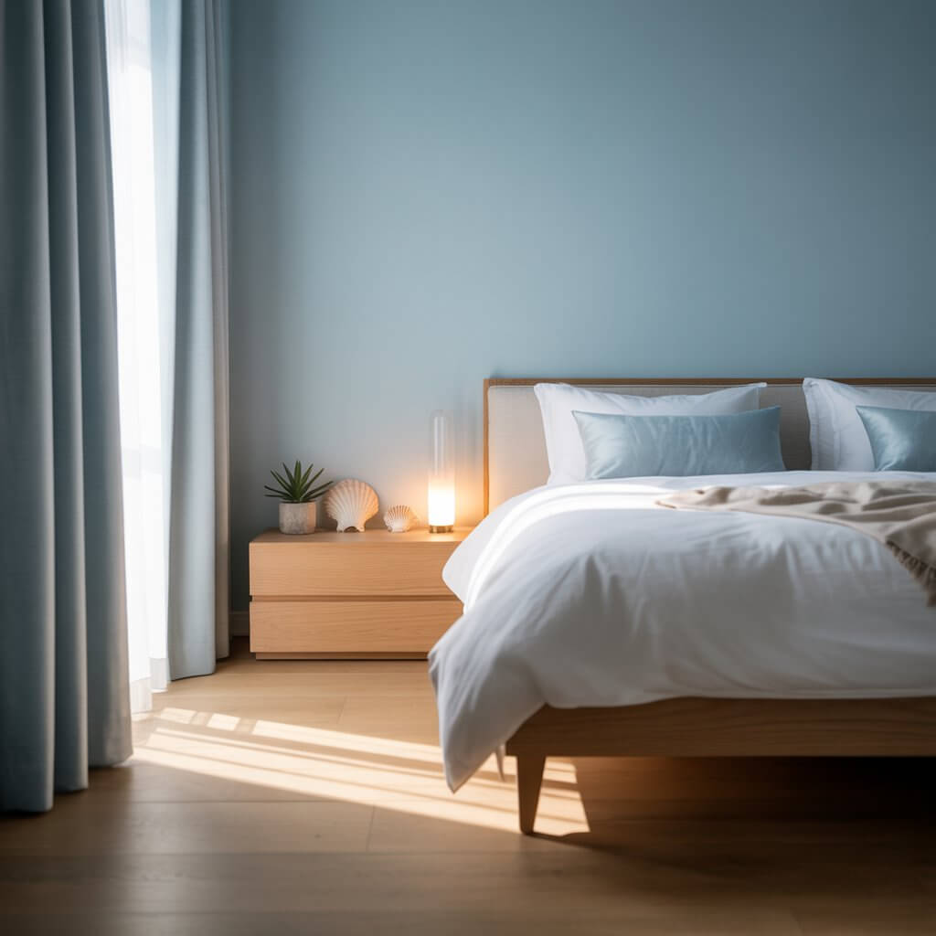
Blue — The Calming Classic
Blue is basically the lavender latte of the color world: soothing, consistent, dependable.
Blue evokes:
- Peace
- Serenity
- Focus
Best for:
- Bedrooms
- Bathrooms
- Home offices
Styling tip: Pair soft blues with crisp whites for a coastal, airy vibe.
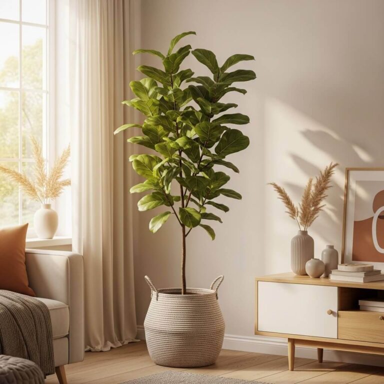
Green — The Harmonious Healer
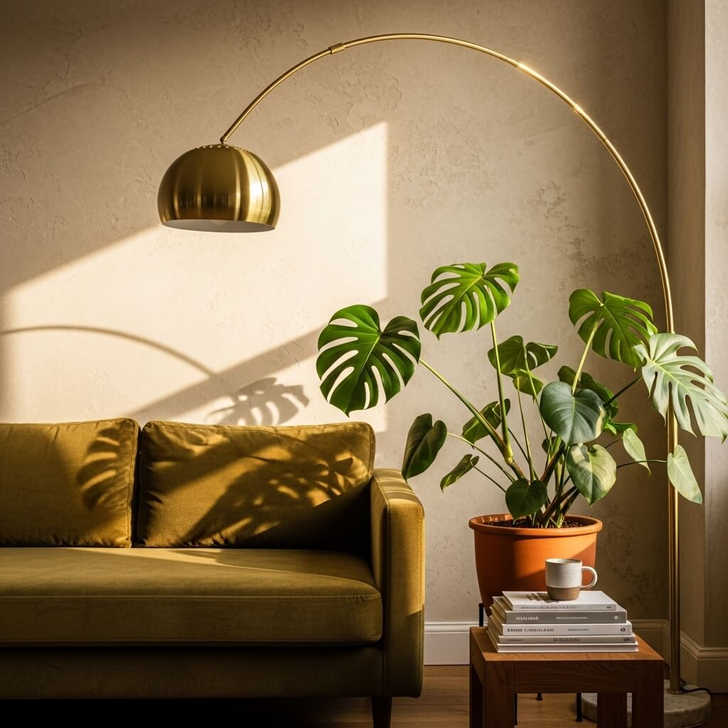
Green is Mother Nature’s favorite, and for good reason — it brings balance.
Green evokes:
- Renewal
- Calm
- Freshness
Best for:
- Living rooms
- Kitchens
- Bedrooms
Styling tip: Olive green + brass = chef’s kiss.
Yellow — Sunshine for Your Space
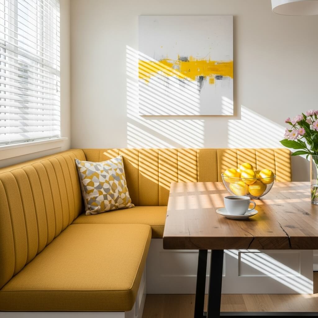
Yellow is like that friend who always shows up cheerful, even on a Monday.
Yellow evokes:
- Optimism
- Warmth
- Creativity
Best for:
- Kitchens
- Dining areas
- Craft rooms
Styling tip: Use yellow sparingly — too much can be overstimulating.
Red — The Bold Energizer
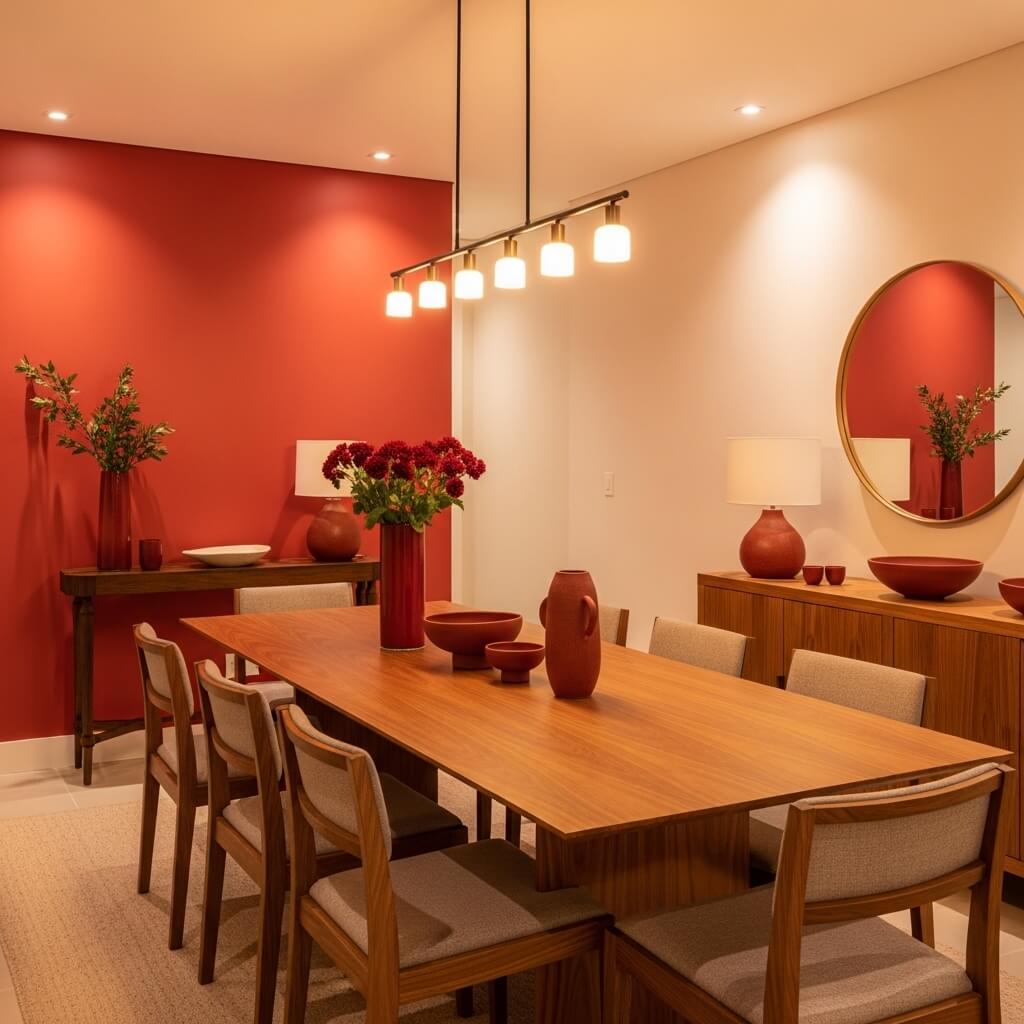
Red is fiery, dramatic, and passionate… but also intense.
Red evokes:
- Excitement
- Confidence
- Appetite (!)
Best for:
- Dining rooms
- Accent walls
- Social spaces
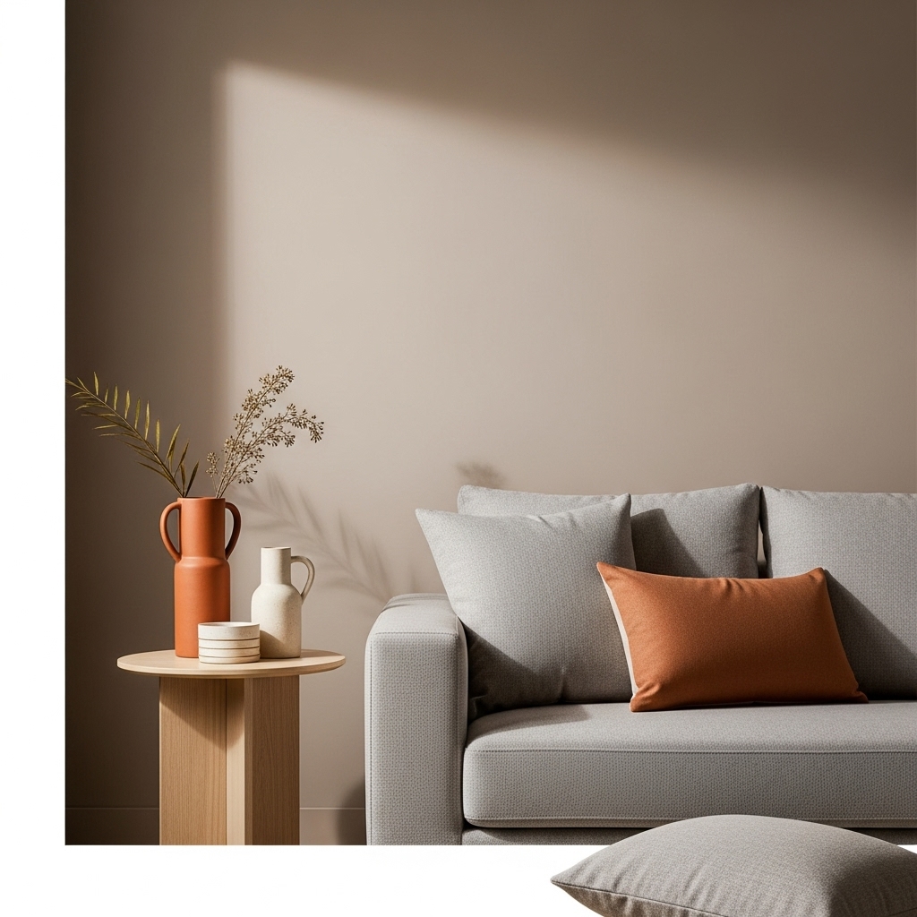
Styling tip: Try terracotta for a softer, earthier version of red.
Pink — The Soft Romantic
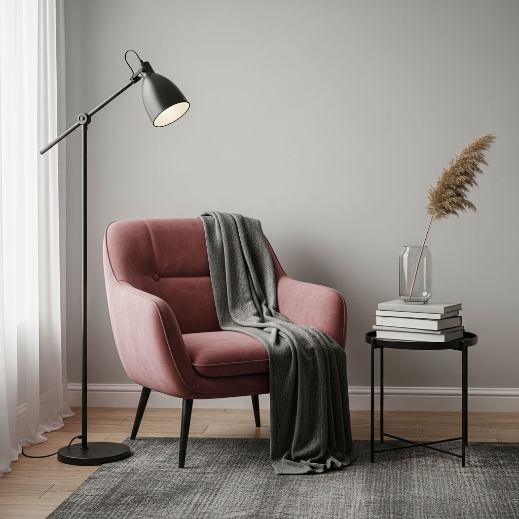
From blush to dusty rose, pink is having a major comeback.
Pink evokes:
- Warmth
- Romance
- Comfort
Best for:
- Bedrooms
- Nurseries
- Reading nooks
Styling tip: Pair pink with charcoal or black for a modern grown-up look.
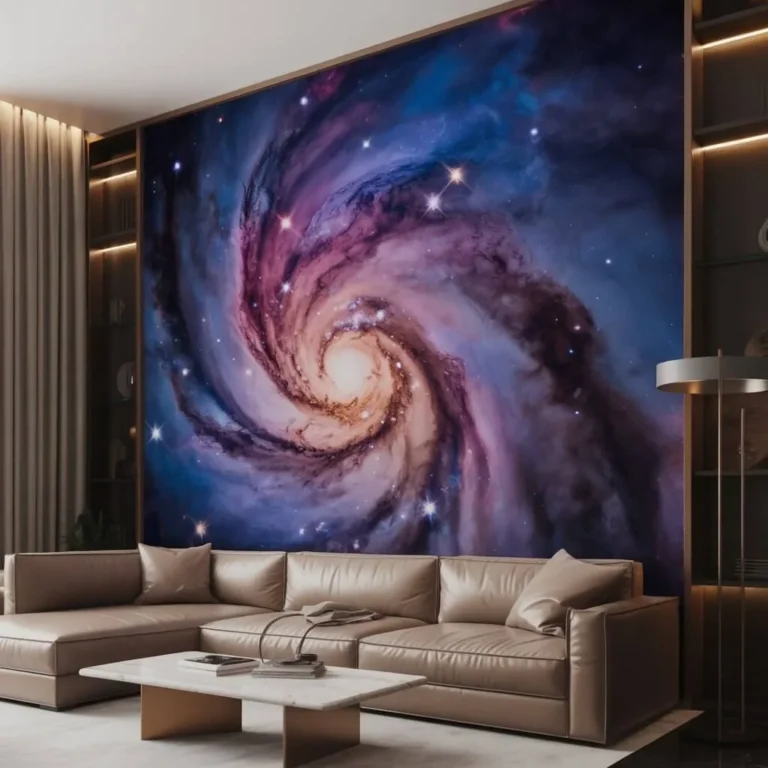
Purple — The Luxurious Dreamer
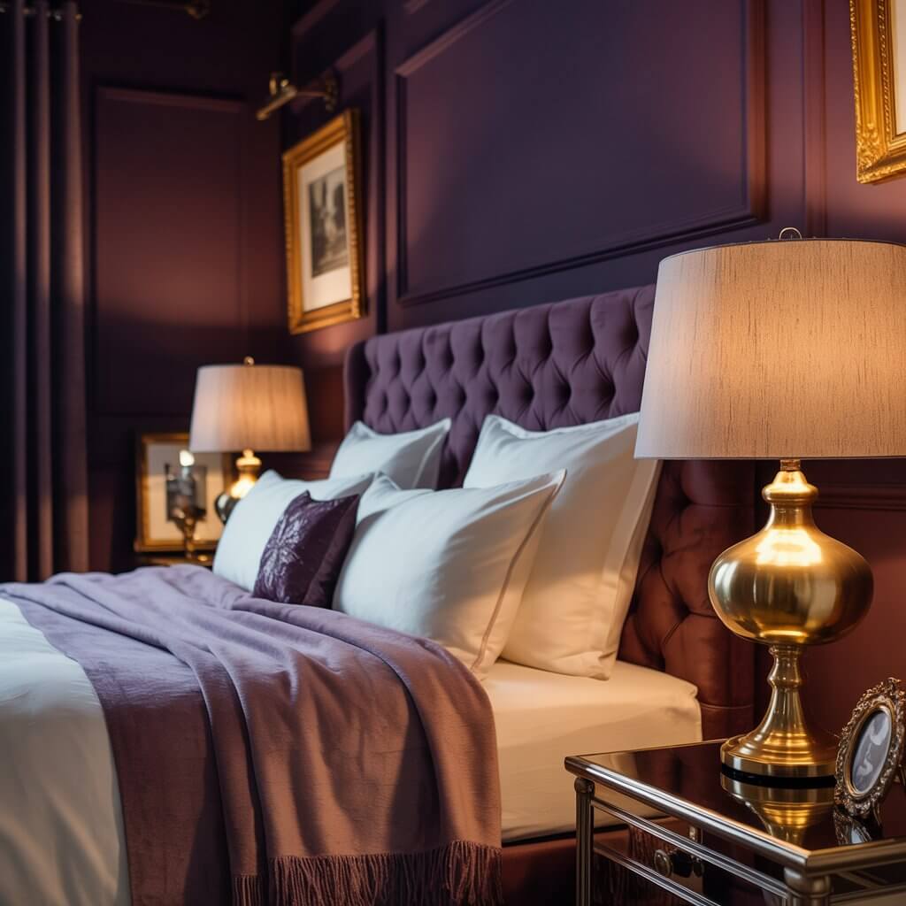
Purple is rich, creative, and a little mysterious.
Purple evokes:
- Imagination
- Luxury
- Calm
Best for:
- Bedrooms
- Home offices
- Boudoir spaces (ooh la la)
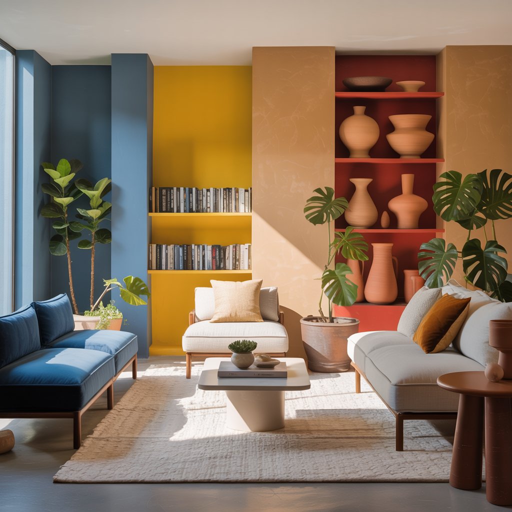
Orange — The Playful Motivator

Orange is energetic and happy — but can be overwhelming when overdone.
Orange evokes:
- Creativity
- Confidence
- Enthusiasm
Best for:
- Gyms
- Game rooms
- Kids’ play areas
Brown — The Cozy Stabilizer
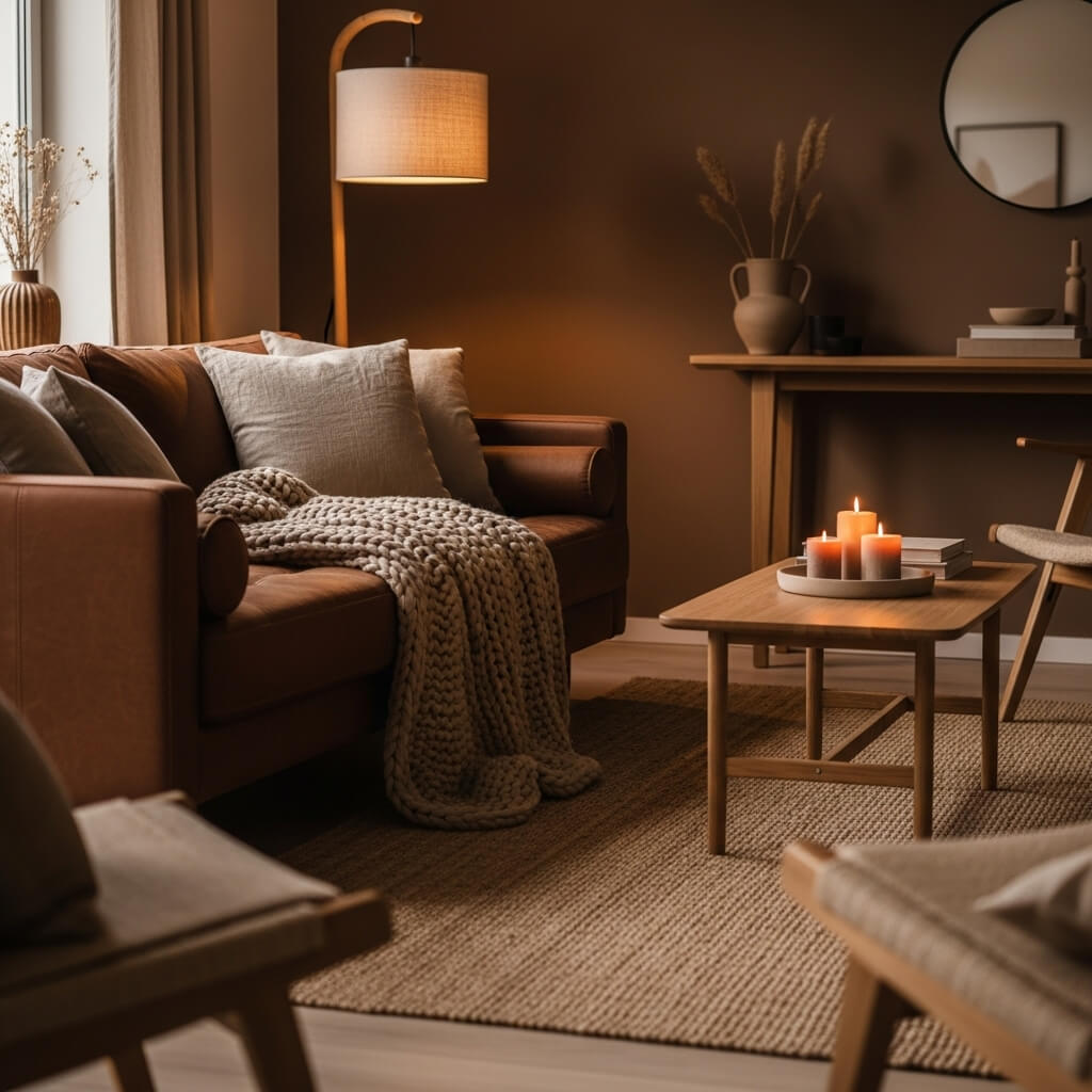
Earthy, grounding, natural — brown is your comfort blanket.
Brown evokes:
- Security
- Warmth
- Stability
Best for:
- Living rooms
- Bedrooms
- Entryways
Styling tip: Layer multiple shades of brown for warm, organic minimalism.
Black — The Sophisticated Statement
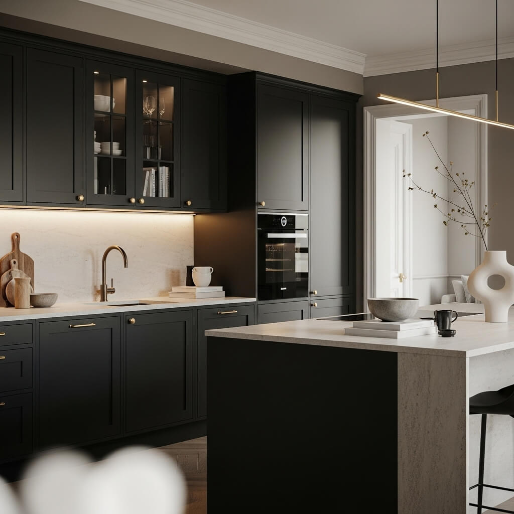
Black? Timeless. Chic. Dramatic. MAJOR Pinterest energy.
Black evokes:
- Elegance
- Depth
- Power
Best for:
- Accent walls
- Bathrooms
- Kitchens (hello, black cabinetry!)
Styling tip: Use matte black for drama without harshness.
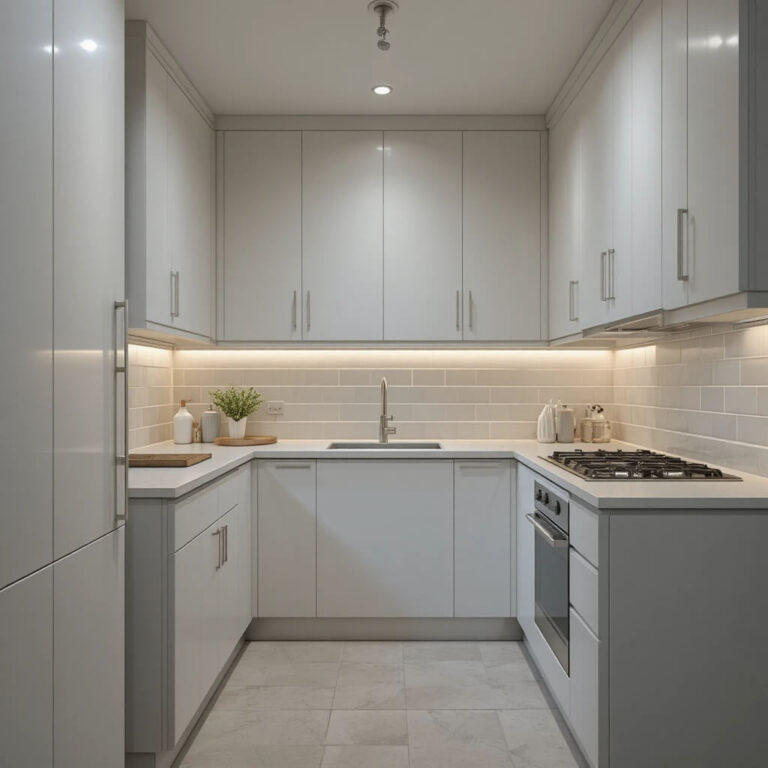
White — The Clean Canvas
White symbolizes purity and simplicity — but also versatility.
White evokes:
- Freshness
- Clarity
- Openness
Best for:
Every room
(Yes, seriously — it’s universal.)
Styling tip: Layer textures to avoid “rental white box syndrome.”
How to Choose the Perfect Color Palette for Your Home
Let’s build your palette like a pro.
Step 1 — Identify the Mood of the Room
Ask yourself:
- Should this space feel calming or energizing?
- Do you want it cozy or bright?
- Is it social or private?
Your emotional goal determines your palette direction.
Step 2 — Consider the Natural Lighting
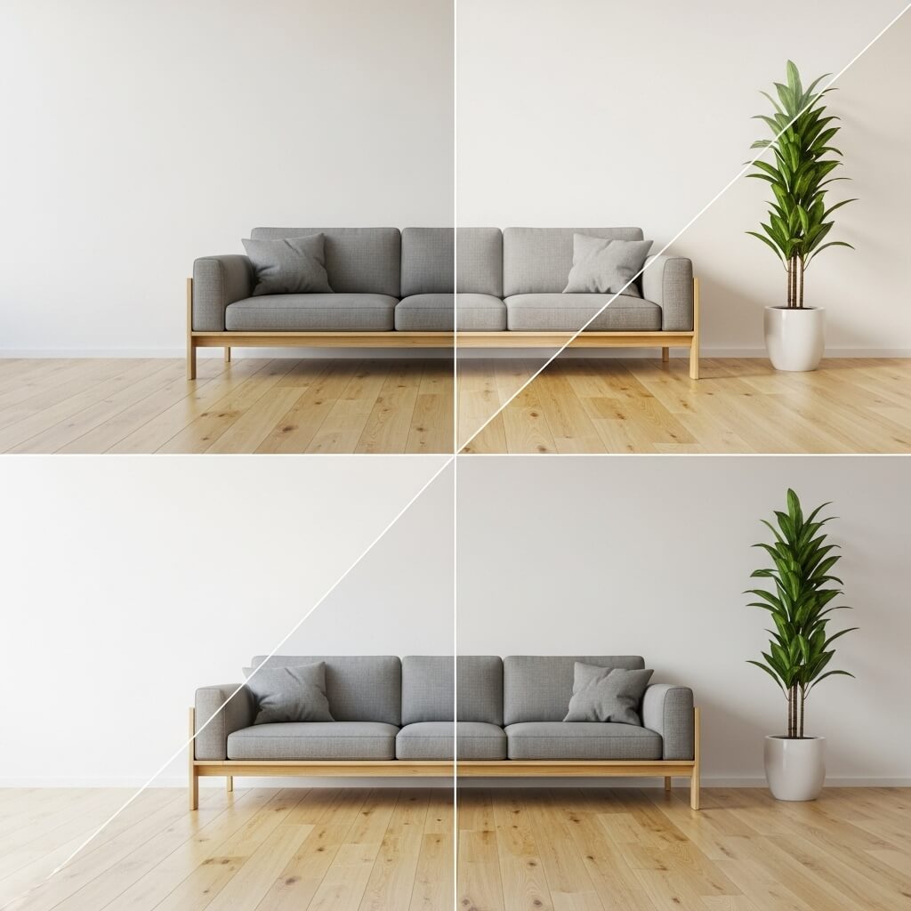
Lighting changes everything.
- North-facing rooms → cooler, muted tones
- South-facing rooms → warm, golden tones
- East-facing rooms → bright mornings, soft evenings
- West-facing rooms → warm afternoons, deep golden sunsets
Always test swatches in different lighting before committing.
Step 3 — Pick a Dominant Color
This is your foundation shade (usually a neutral or soft tone).
Common dominant colors:
- Warm beige
- Off-white
- Greige
- Light gray
- Muted sage
Step 4 — Add Your Secondary Colors
These support the dominant color and appear in furniture, rugs, or accent pieces.
Example combos:
- White + navy + gold
- Beige + sage + wood tones
- Black + blush + cream
Step 5 — Add Accent Colors for Personality
This is where your fun hues shine.
Use in:
- Pillows
- Wall art
- Decor pieces
- Lamps
- Throw blankets
Suggested accent colors:
- Mustard
- Emerald
- Burnt orange
- Terracotta
- Dusty pink
Step 6 — Use the 60-30-10 Rule
A classic interior design formula:
- 60% dominant color
- 30% secondary color
- 10% accent color
It keeps everything visually balanced.
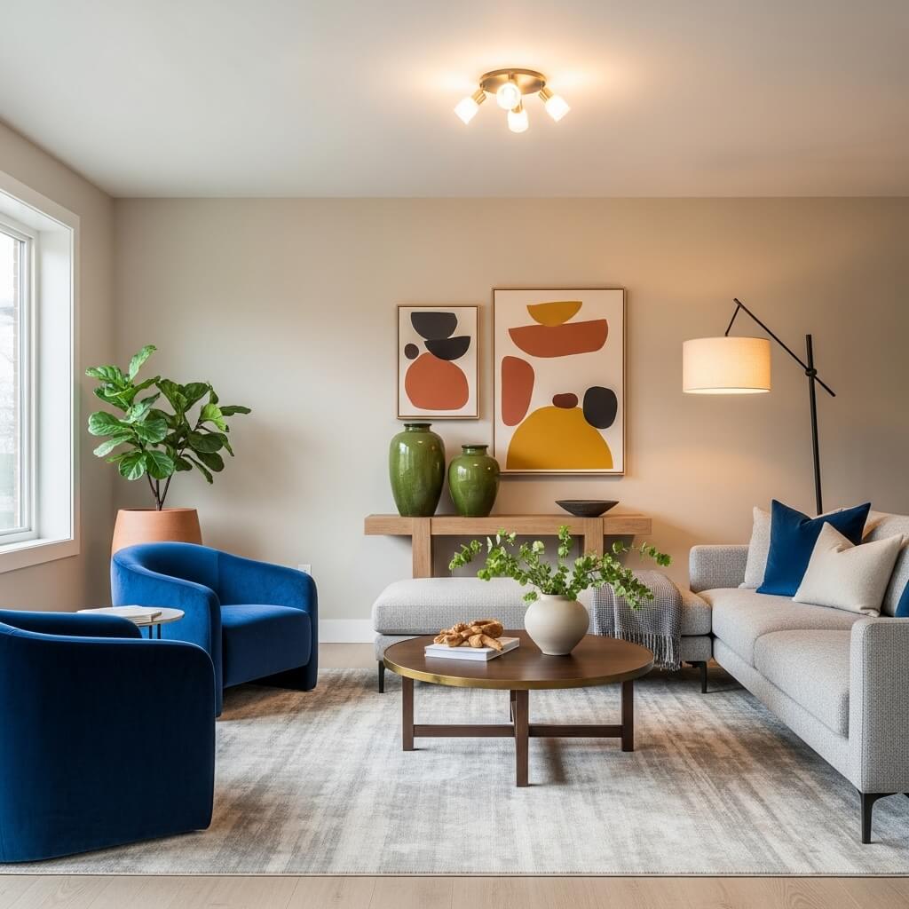
Room-by-Room Color Psychology Guide
Living Room – Warm, Welcoming, and Relaxed
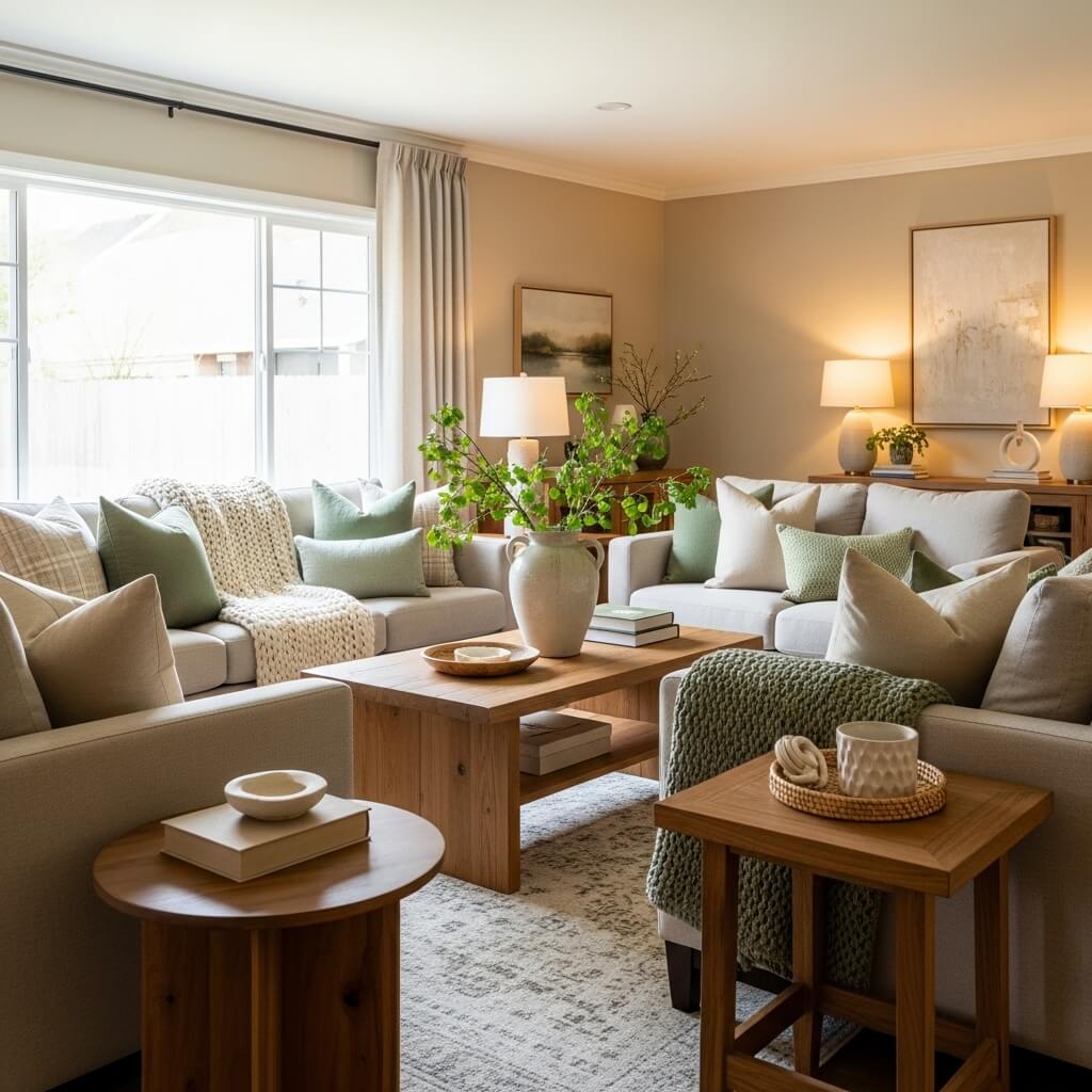
Choose colors that encourage conversation and comfort.
Best colors: beige, soft greens, blues, warm taupes
Avoid: overly bright reds (can feel chaotic)
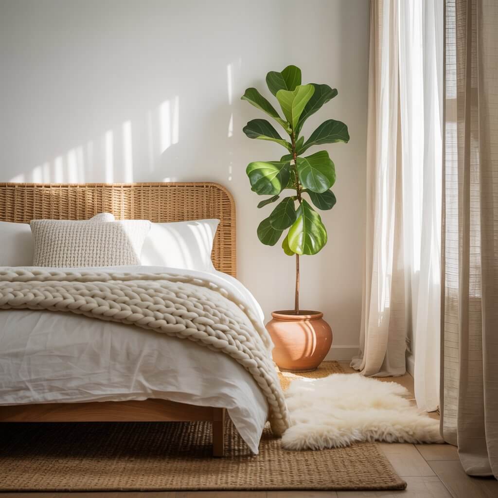
Bedroom – Soft, Dreamy, and Peaceful
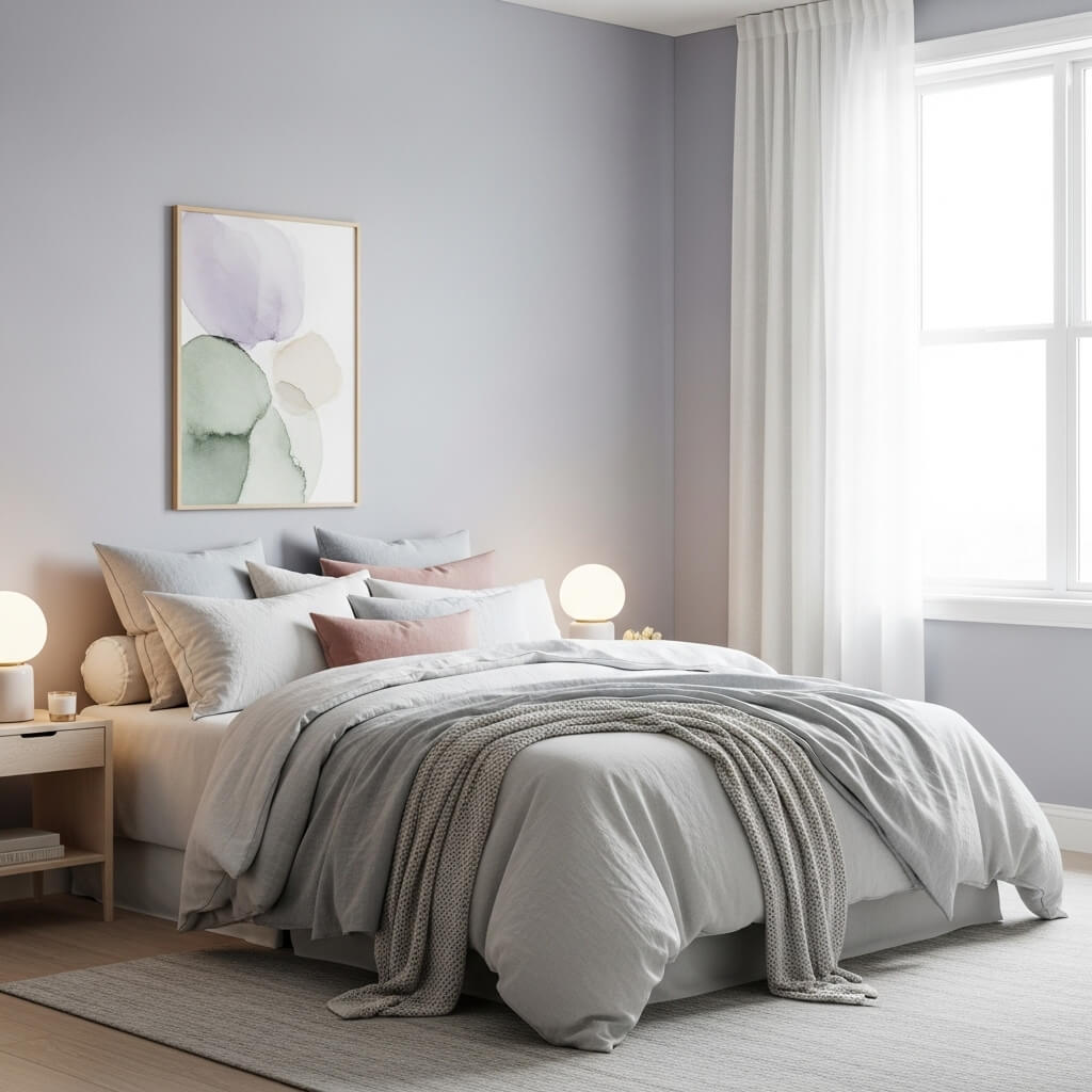
Your sanctuary deserves colors that soothe your soul.
Best colors: lavender, sage, powder blue, blush
Avoid: bright yellow or red — too stimulating
Kitchen – Bright, Clean, and Happy
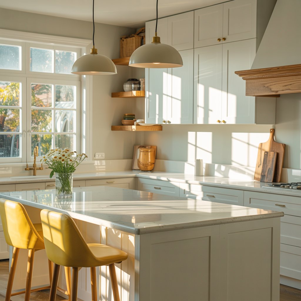
You want energy but not chaos.
Best colors: white, soft yellow, muted blues
Avoid: neon green (trust me)
Bathroom – Spa-Like Calm
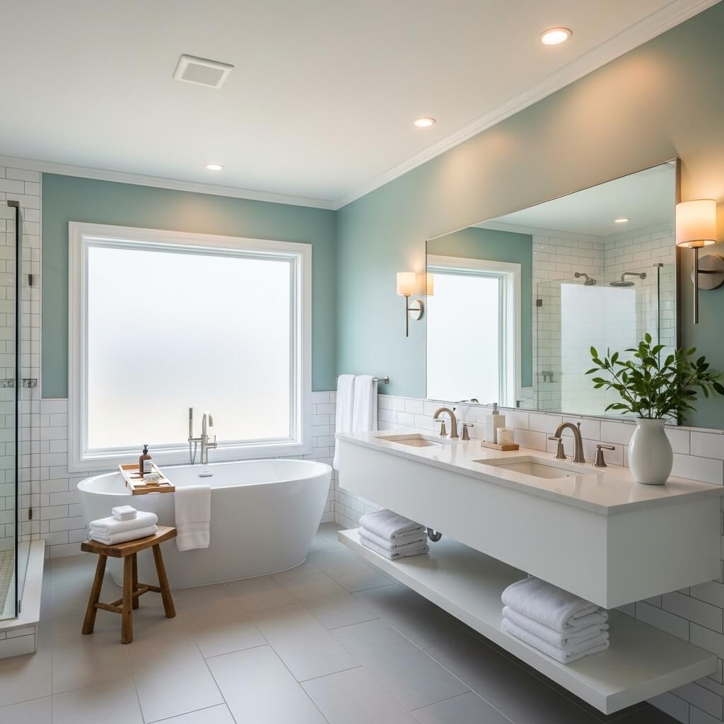
Whether you’re in a bubble bath or rushing to work, calm is the vibe.
Best colors: aqua, ivory, slate grey, seafoam
Avoid: overly dark colors in small bathrooms
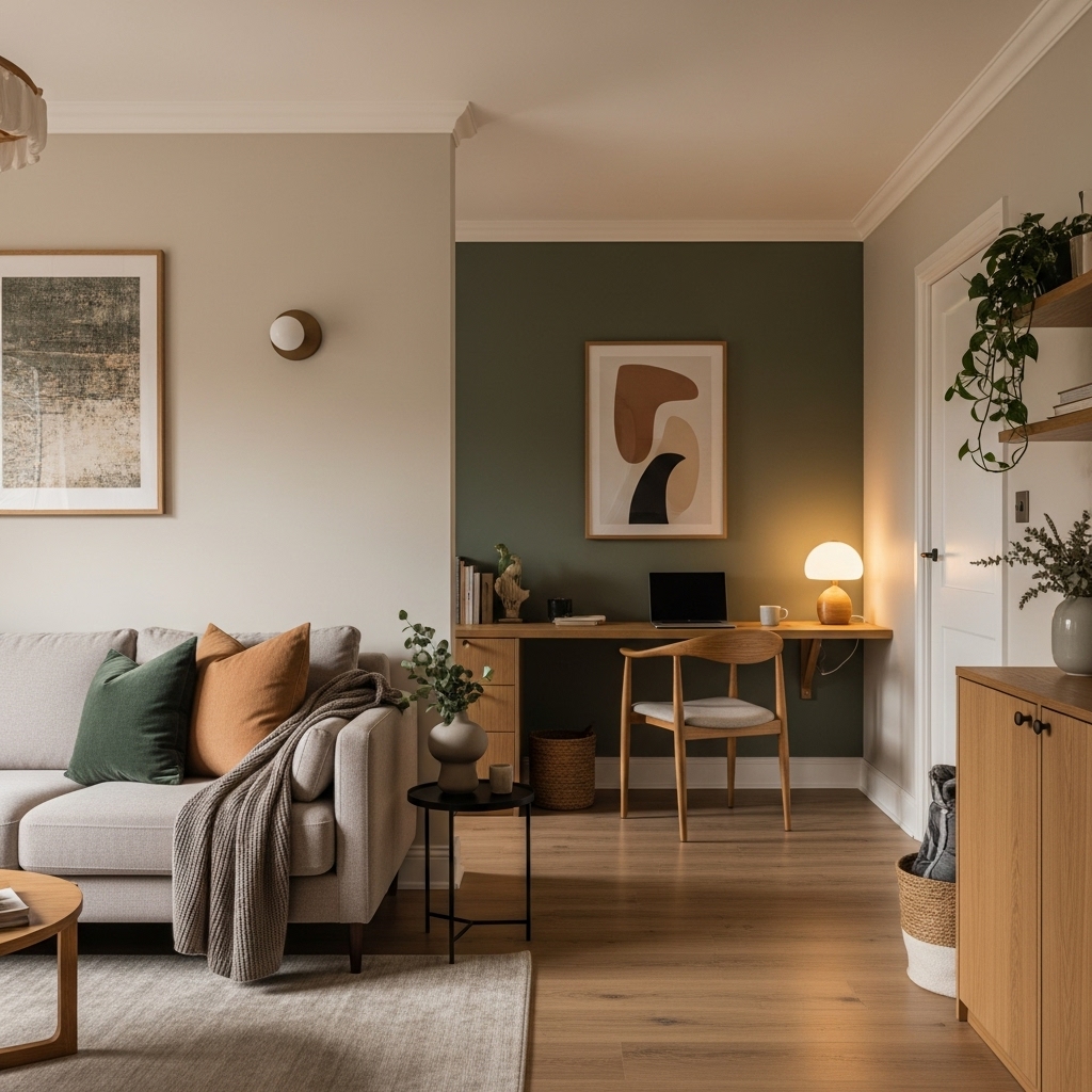
Home Office – Focused, Motivated, Productive
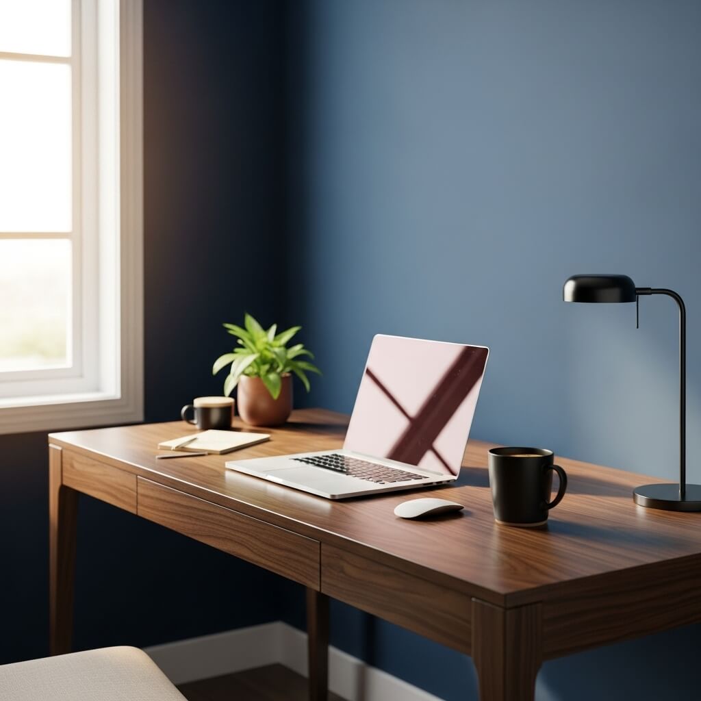

Choose colors that help you stay centered.
Best colors: navy, forest green, gray-blue
Avoid: distracting bright tones
Color Mistakes People Make (and How to Avoid Them)
1. Ignoring undertones
Cool vs warm undertones can make or break a palette.
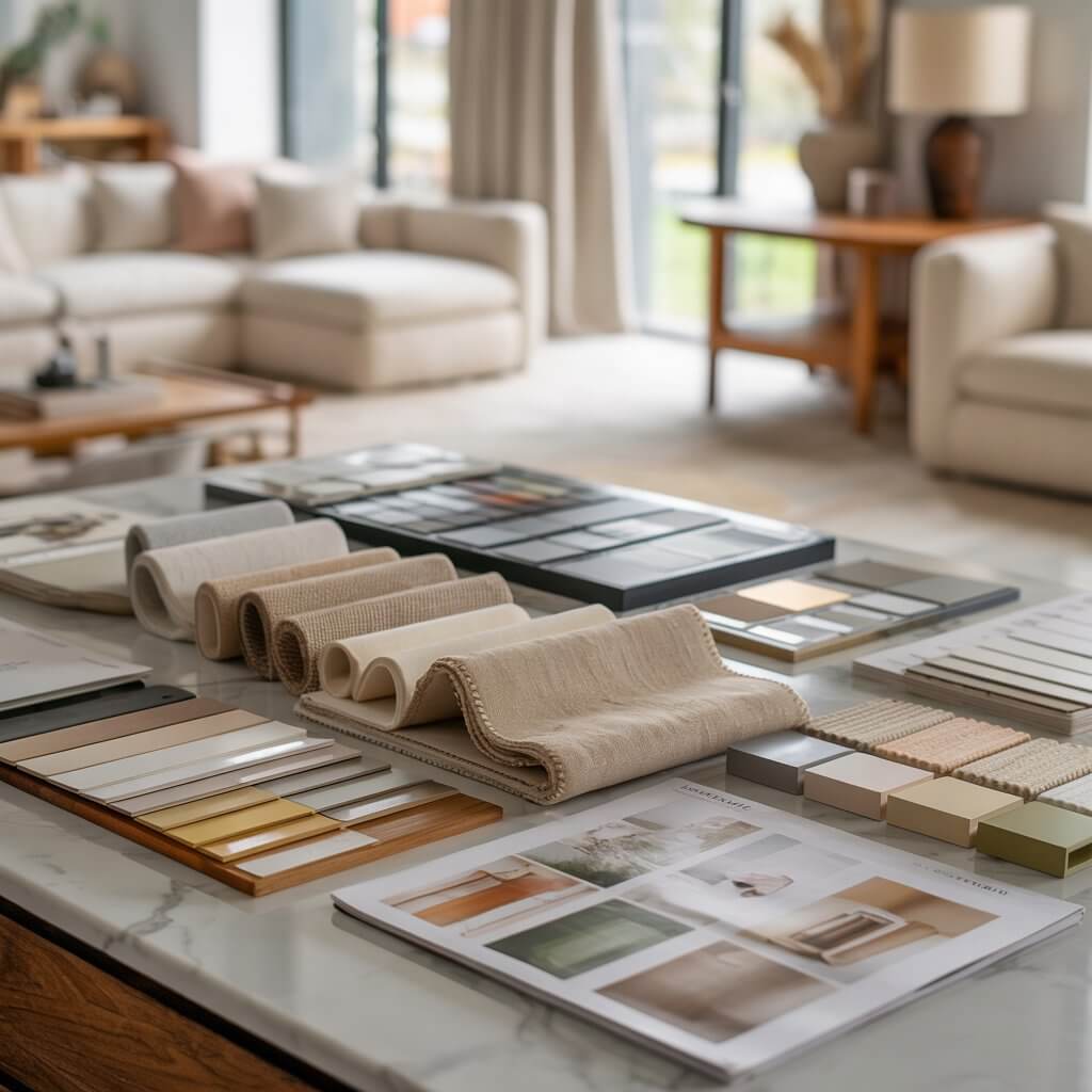
2. Choosing paint in-store
Always test at home with your lighting.
3. Going too bold too fast
Start with accents before painting an entire wall red or cobalt.
4. Forgetting room-to-room flow
Your home should feel like one continuous story.
5. Not testing samples vertically
Paint looks different on walls than on ceilings or flat boards.
Trending Color Palettes You’ll Love
1. Earthy Minimalism
Sage, beige, clay, white
Warm, grounded, cozy
2. Moody Luxe
Charcoal, deep plum, gold
Sophisticated and dramatic
3. Soft Scandinavian
Cream, oat, soft grey, muted blue
Airy and calming
4. Modern Coastal
Navy, white, sand, eucalyptus green
Crisp and refreshing
Final Tips to Master Color Psychology Like a Designer
- Always consider how you want the room to feel
- Layer textures for depth
- Use samples — never skip this!
- Add natural elements (wood, plants, brushed metals)
- Balance warm + cool tones for harmony
Your perfect palette isn’t about perfection — it’s about emotion.
Conclusion — Your Home, Your Story
Choosing colors for your home isn’t about following trends — it’s about creating spaces that support your emotions, lifestyle, and personal taste.
Now that you understand color psychology, you can confidently build a palette that not only looks stunning but feels right.
If you loved this guide, explore more décor inspiration and room-by-room styling ideas on the blog.
FAQs About Color Psychology in Interior Design
1. What is the best color for a relaxing bedroom?
Soft blues, greens, and muted lavenders are scientifically shown to calm the mind and improve sleep quality.
2. Which colors make a room look bigger?
Light neutrals — white, cream, light gray, and soft pastels — help reflect light, making small spaces feel larger.
3. What color increases productivity?
Blue and green are excellent for focus and calm, while muted yellow boosts creativity.
4. How do I pick a cohesive palette for my whole house?
Choose one main neutral, two supporting tones, and one or two accent hues repeated throughout the home.
5. Can bright colors work in minimal interiors?
Yes — use them as accent pieces (pillows, artwork, vases) rather than large surface