16 Monochrome Decor: Working With One Color Beautifully
Okay, let’s be real. Sometimes color palettes stress me out. Do these blues match? Is that mustard accent too… aggressive? If you’ve ever felt that way, let me introduce you to the magic of monochrome.
Sticking to one color isn’t a design cop-out—it’s a power move. It’s serene, it’s sophisticated, and honestly, it takes a lot of the guesswork out of decorating. Think of it as a stylish shortcut to a pulled-together room.
So, grab your favorite shade (even if it’s fifty versions of beige—no judgment here), and let’s explore how to nail the single-color look.
1. Start With a Texture Map, Not a Paint Swatch
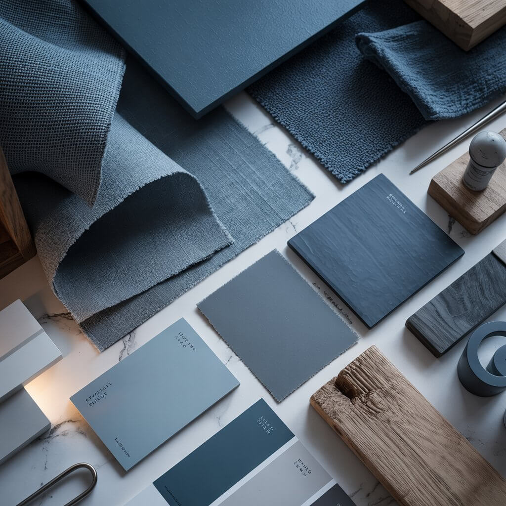
Forget picking a wall color first. Instead, gather fabric samples, wood stains, metal finishes, and flooring options all in your chosen hue family. See how that slate blue looks as linen, ceramic, and weathered wood. This prevents your room from feeling flat and gives you a tactile plan to follow.
Pro Tip: I literally keep a “texture box” with scraps of materials from past projects. Swatching a new velvet against an old tile sample has saved me from some pricey mistakes. It’s a game-changer.
2. Embrace the “Almost Black” Version of Your Color
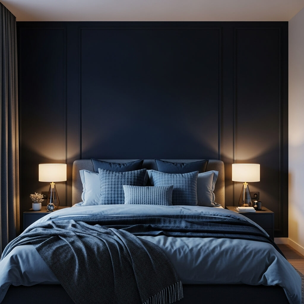
Every color scheme needs an anchor. Using a deep, saturated version of your color—think forest green instead of lime, or navy instead of sky blue—as an accent adds drama and depth. Try it on an accent wall, a large piece of furniture, or the interior of built-in bookshelves.
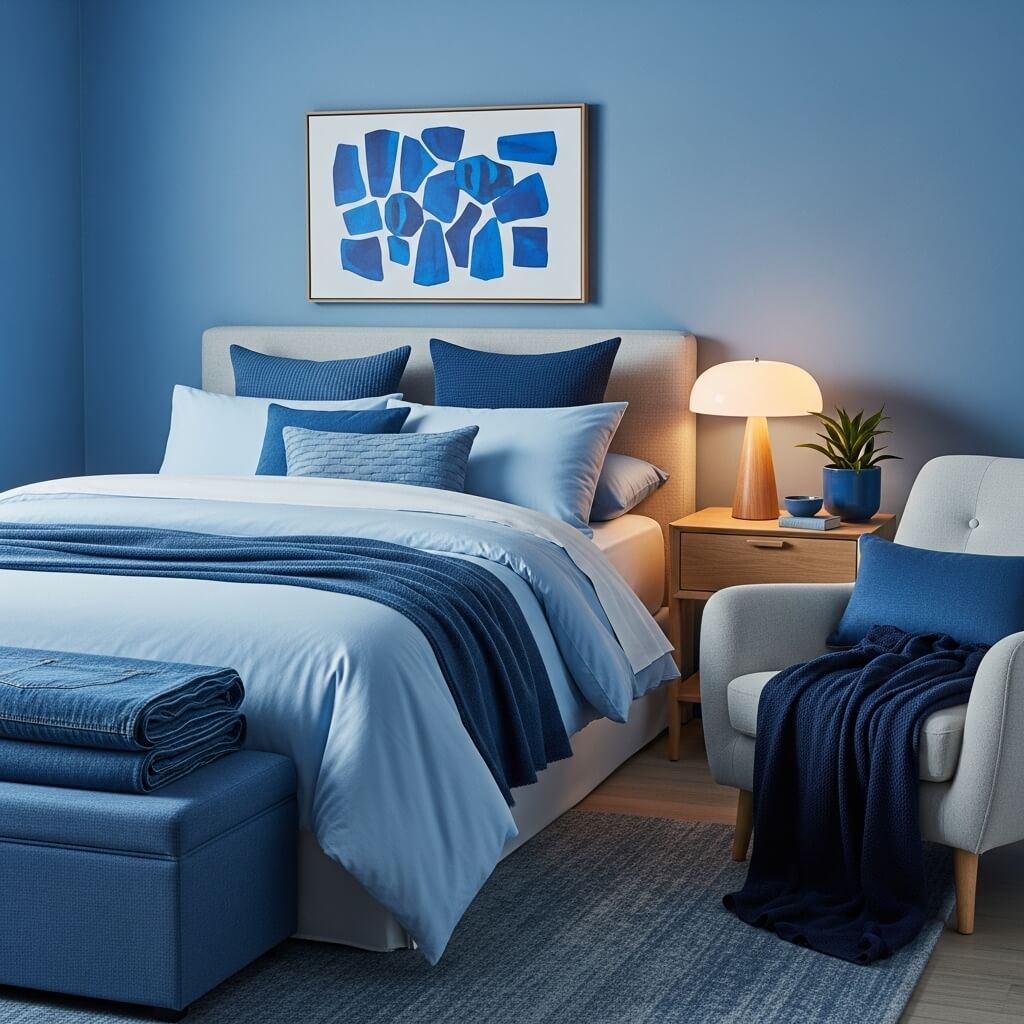
Personal Fave: I used an “almost black” charcoal blue on my bedroom’s focal wall. It reads as sophisticated, not gloomy, and makes my lighter blue bedding just pop. It’s the secret to a room that feels designed, not just decorated.
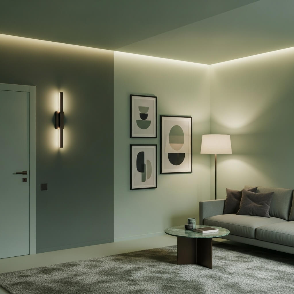
3. Let Your Lighting Do the Heavy Lifting
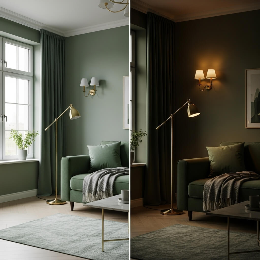
Lighting changes everything. Cool, bright LEDs will make your greens feel crisp and modern, while warm, dimmable incandescents will turn those same greens into cozy, earthy tones. Layer your lighting with floor lamps, sconces, and dimmers to literally shift the mood of your color throughout the day.
Story Time: I once painted a room what I thought was a soft gray. At night under warm bulbs, it turned a mysterious, lovely lavender. It was a happy accident that taught me to always test paint under the light it will actually live in.
4. Go Wild with Pattern (Yes, Really!)
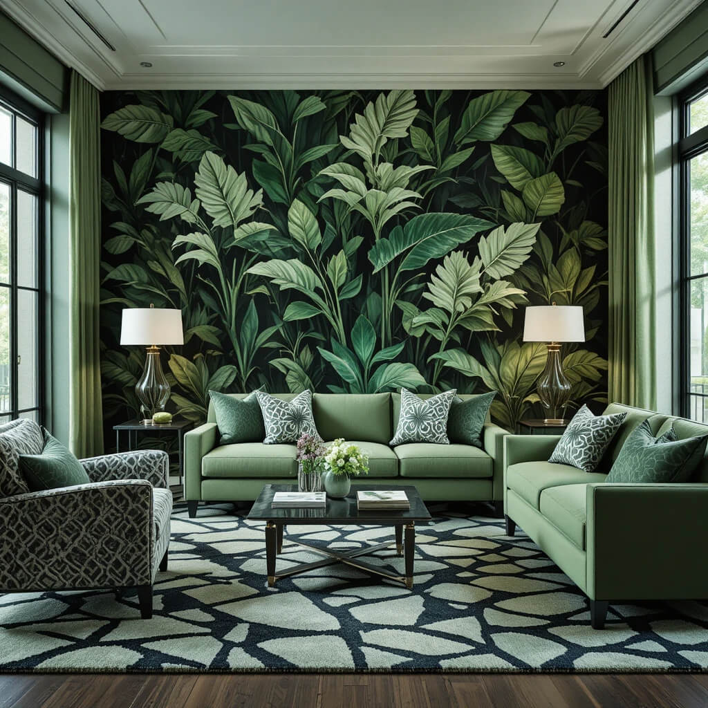
Monochrome is your permission slip to go bold with pattern. A geometric black-and-white rug, a large-scale botanical print in varying greens, or a tonal striped wallpaper adds massive visual interest. Because the colors are in the same family, the pattern feels exciting, not chaotic.
Pro Move: Mix different pattern scales. Pair a large, dramatic print on curtains with a small, tight geometric on throw pillows. This contrast keeps the eye moving and feels incredibly curated.
5. Introduce a “Neutral” from Within the Palette
Your true neutral doesn’t have to be white, gray, or beige. Find the lightest, most muted tone in your color spectrum and use it where you’d normally use a neutral. That dusty rose can be your “white” for trim. That pale oat can be your “gray” for a sofa. It creates a seamless, enveloping effect.
Downside: Using a colored “neutral” on large surfaces (like a sofa) can make it trickier to drastically change your style later. But if you’re committed to the vibe, it’s 100% worth it.
6. Create a tonal gallery wall
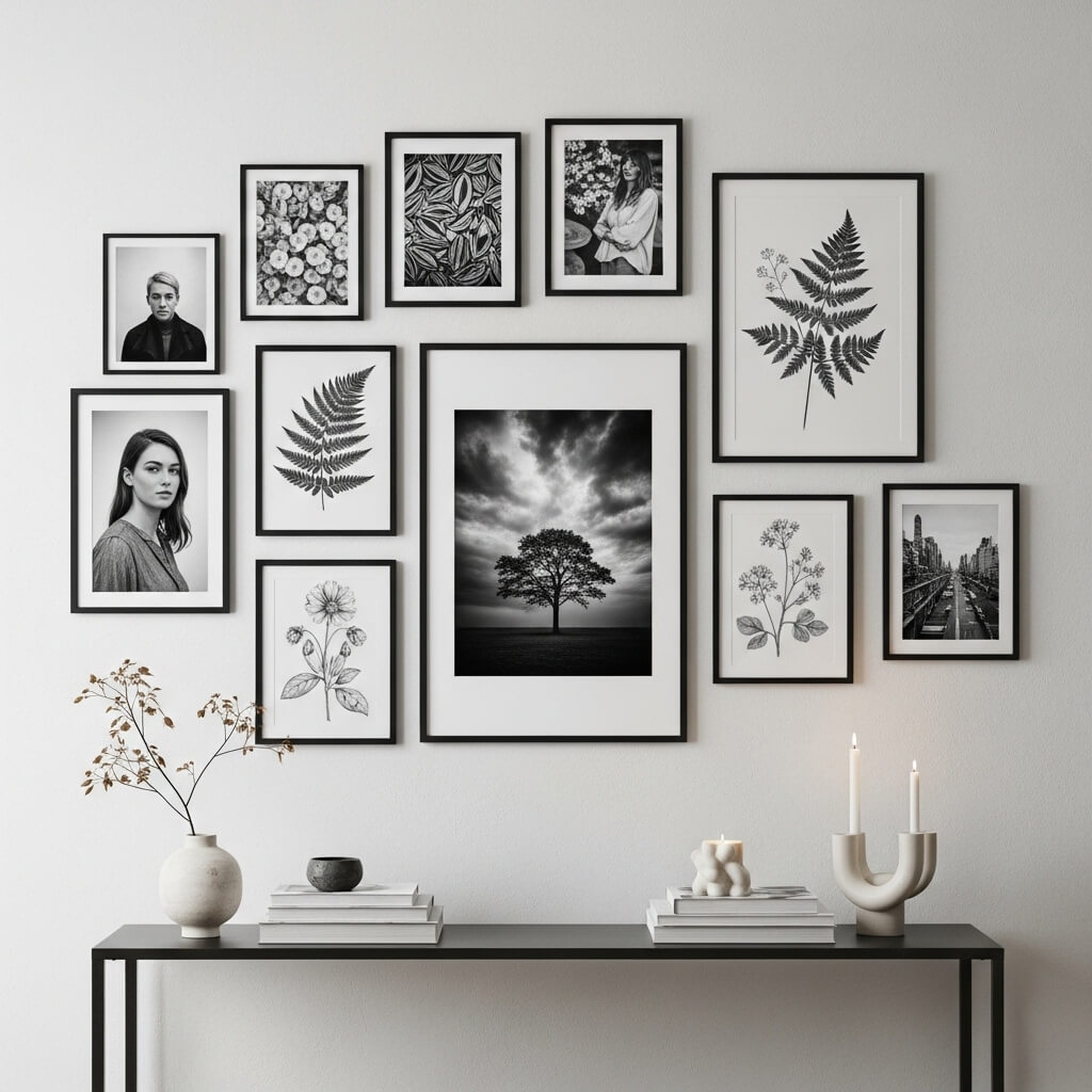
Ditch the expectation that art must be a splash of contrasting color. Collect artwork, photographs, and objects all within your monochrome scheme. Frame everything in similar tones (black, white, or natural wood). The variation in imagery and texture becomes the focus, creating a deeply personal and cohesive statement.
Personal Take: I have a wall of only black-and-white photography and botanical sketches. It feels incredibly intentional and calm, unlike my old, chaotic multi-color gallery wall that just gave me anxiety.
7. Play with Sheen and Finish
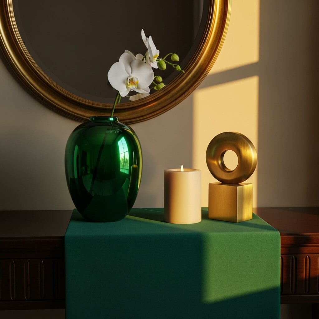
This is where the magic happens. Combine matte, satin, gloss, and metallic finishes in your single color. A glossy emerald green vase on a matte emerald tablecloth is instantly captivating. Brushed brass (a form of yellow/gold) against flat mustard velvet? Chef’s kiss.
Pro Tip: Generally, use higher sheens (gloss, metallic) as accents. They catch the light and act as jewelry for the room. Save matte finishes for large surfaces like walls or big upholstered pieces.
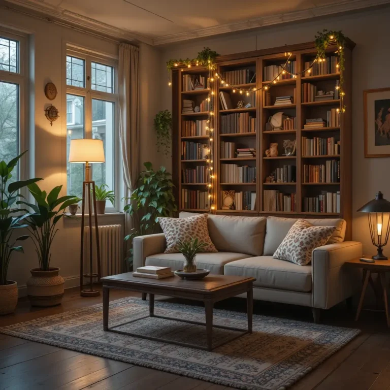
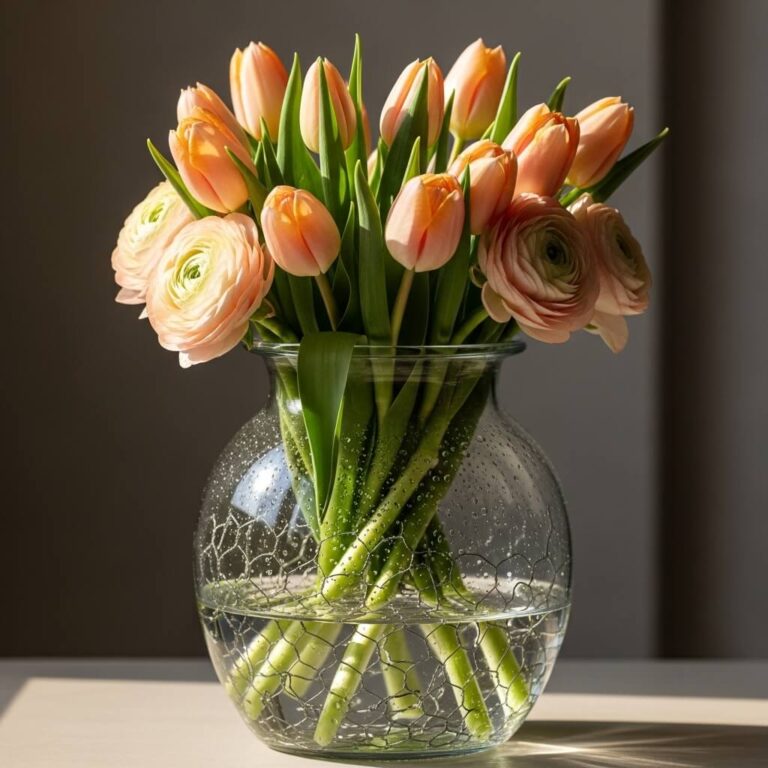
8. Add a Living Element
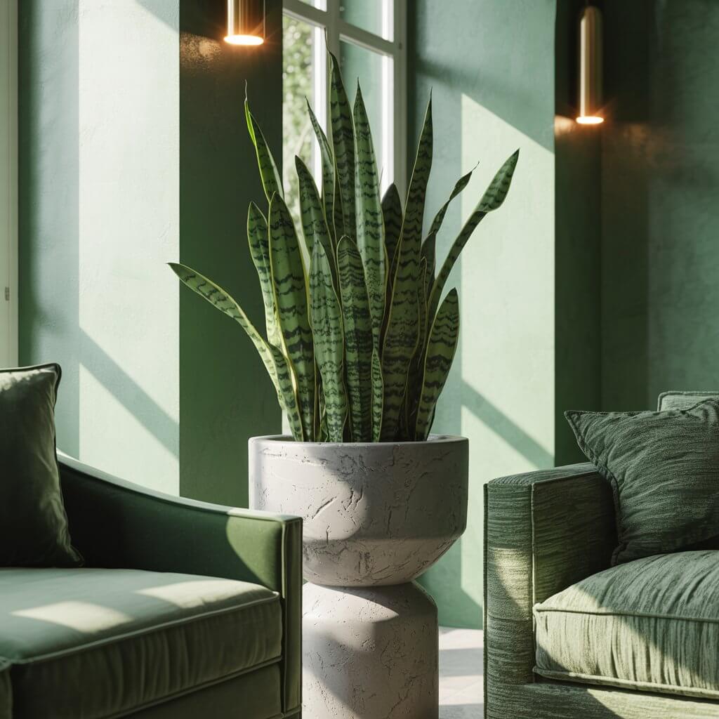
A monochrome room needs a breath of fresh air—literally. Introduce plants, flowers, or even a bowl of fruit in your chosen palette. Think a snake plant for greens, a vase of dried pampas grass for beiges, or a cyclamen for pinks. It adds organic texture and life.
FYI: If you’re a notorious plant murderer (like I once was), high-quality faux plants or even a beautiful piece of driftwood can give you that natural vibe without the commitment. No shame!
9. Don’t Shy Away from a Colored Ceiling
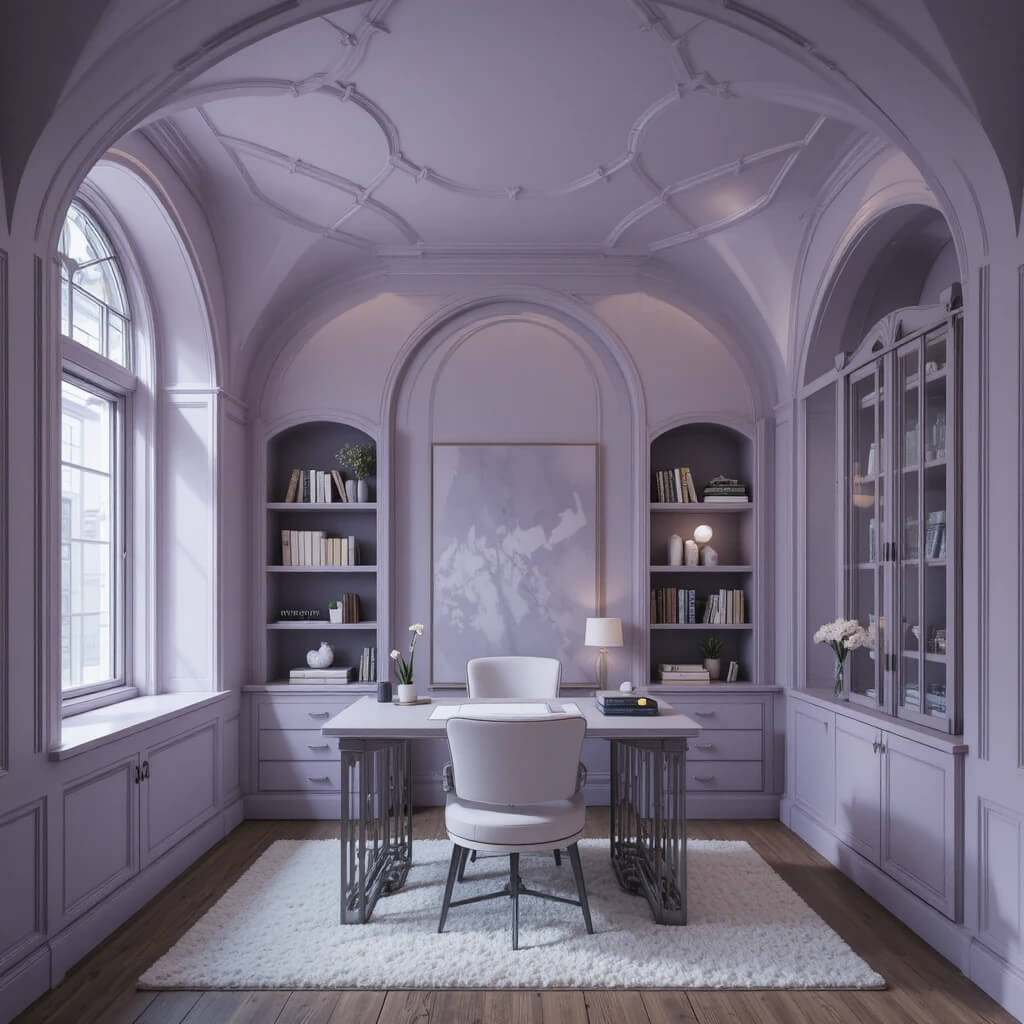
The fifth wall is your secret weapon. Painting the ceiling a soft version of your wall color makes the room feel cozy and cocoon-like. Using a slightly darker or lighter tone than the walls adds dimension without breaking the monochrome spell.
Story Time: I painted my study ceiling a pale lavender-gray, two shades lighter than the walls. Friends can’t pinpoint why the room feels so put-together and tall, but I know it’s the ceiling! It’s an unexpectedly chic trick.
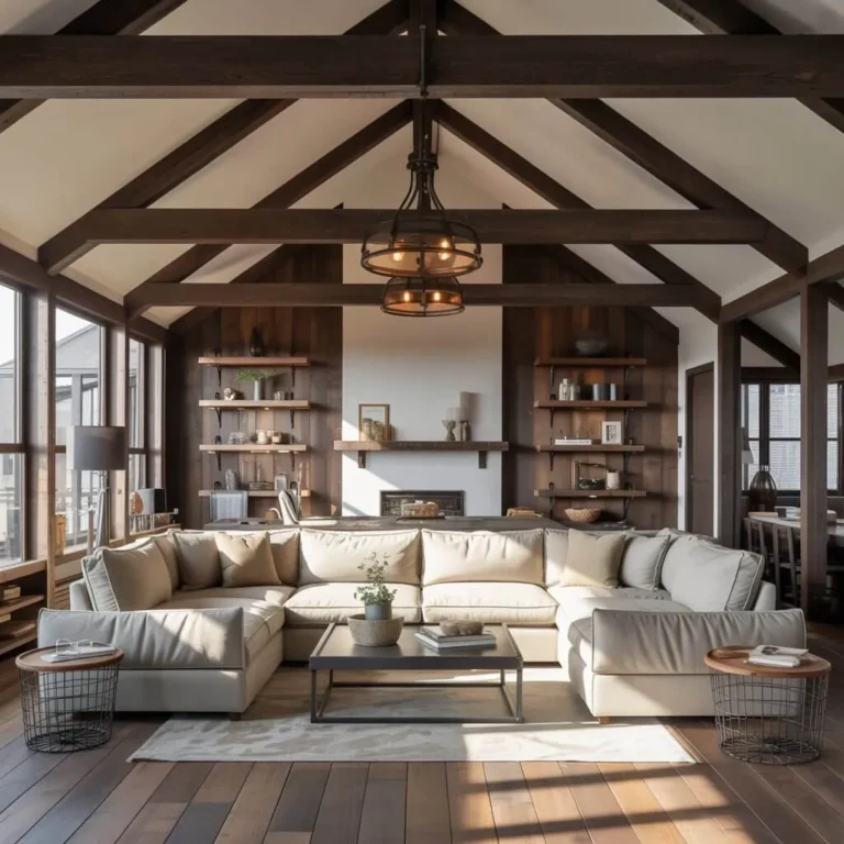
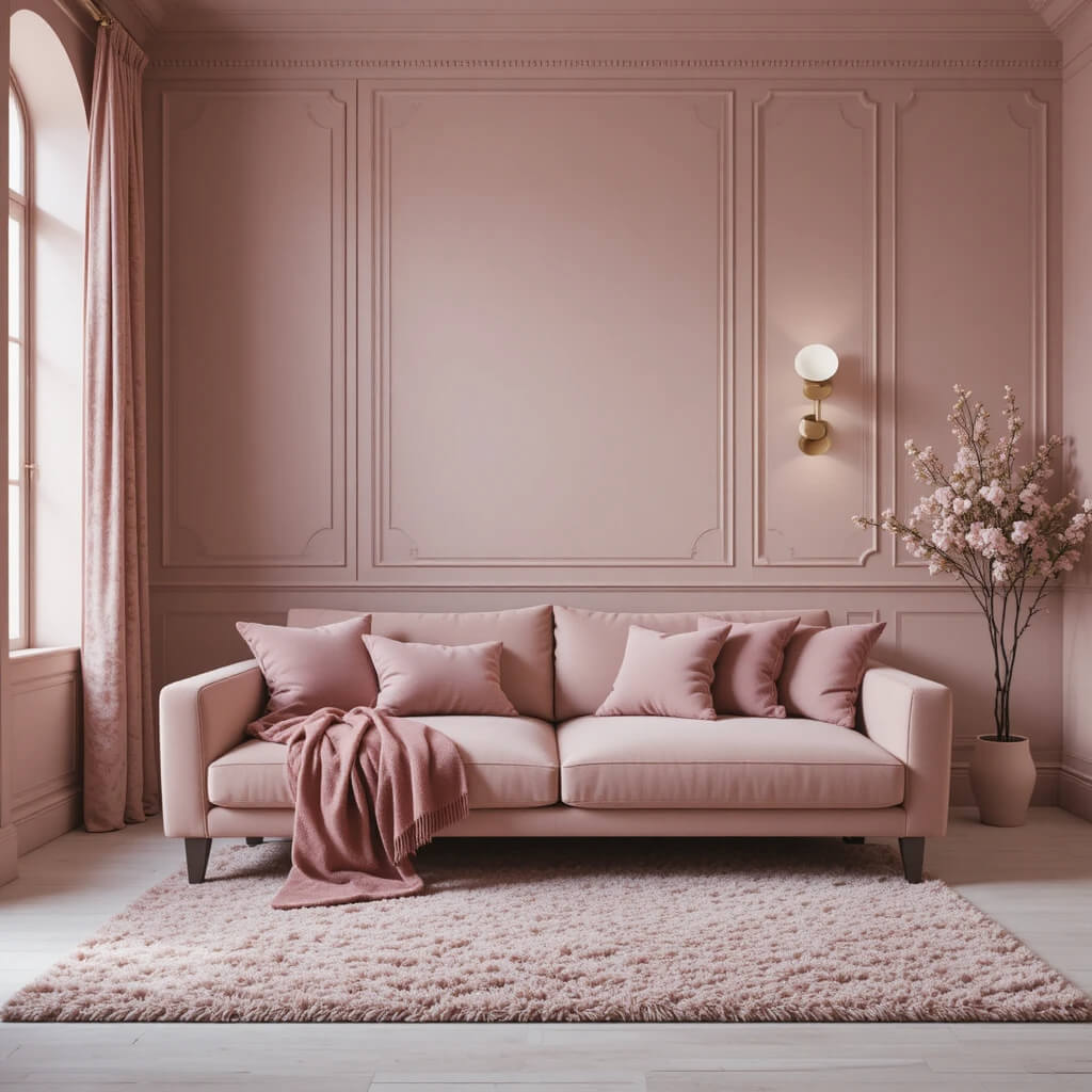
10. Layer Every Shade You Can Find
Grab every paint card in your color aisle. Your goal isn’t to pick one, but to use them all. From the palest tint to the deepest shade, layer them throughout the space. This creates a rich, nuanced look that’s the opposite of boring.
Personal Fave: In my blue guest room, I have over seven shades in play, from ice blue sheets to a denim chair to a navy throw. It feels complex and expensive, not flat.
11. Use Unexpected Materials
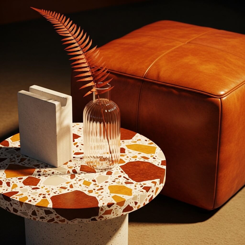
Look beyond paint and fabric. Concrete, terrazzo, stained glass, ribbed glass, leather, and rattan all come in color variations. A terrazzo side table with chips of your color, or a leather ottoman in the perfect rust tone, adds irreplaceable character.
Pro Move: Hunt for vintage or second-hand pieces in unique materials. They have a patina and history that new items just can’t replicate, adding soul to your scheme.
12. Commit with a Statement Piece
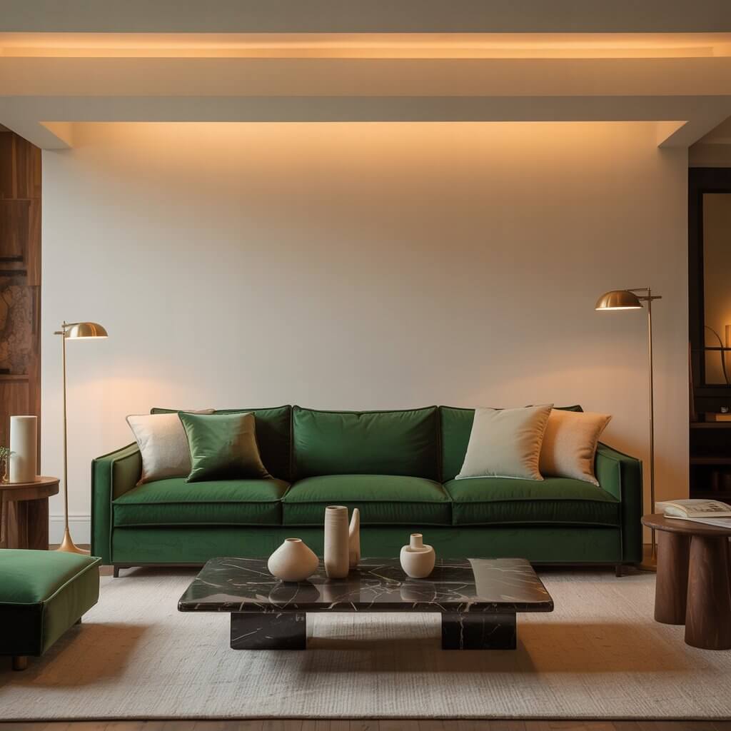
Sometimes you need to go big. A monochrome, textured headboard, a boldly colored sofa, or a large piece of art sets the tone for the entire room. Build your layers outward from this anchor piece, pulling the more subtle shades from it.
Downside: A large, colored statement piece is a commitment. Make sure you really love the color, as it will dictate your room’s life for a long while. But when you get it right? Pure satisfaction.
13. Monochrome Doesn’t Mean Matchy-Matchy
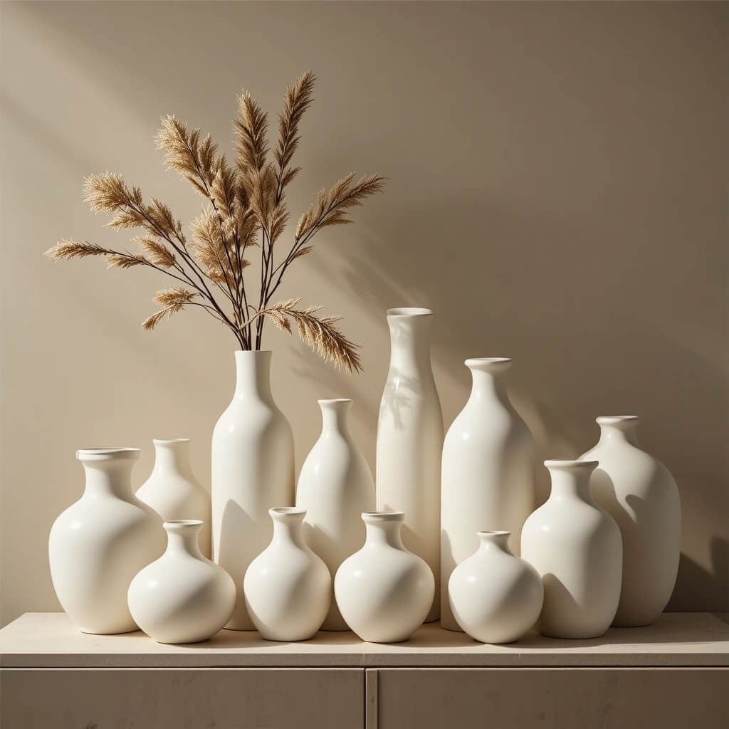
This is the golden rule. Your objects should converse, not chorus. A cluster of vases in the same blue should be different heights, shapes, and textures. IMO, a perfectly matched set can look like a store display. A curated collection looks like your display.
Personal Take: I’d take a mismatched set of three cream-colored ceramic vessels over a boxed set any day. The slight differences tell a story and feel much more organic.
14. Pay Attention to Flooring
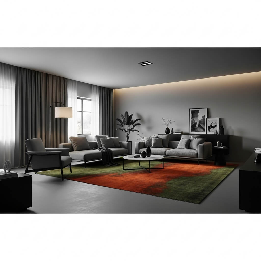
Your floor is a massive canvas. A richly colored rug, stained hardwood, or even painted floorboards in your palette can ground the entire space. Don’t just default to a neutral jute rug—see it as an opportunity to add another layer of your color story.
Pro Tip: A large area rug in your monochrome scheme can unify all your furniture pieces, making even an eclectic mix feel totally intentional.
15. Accessorize with Intention
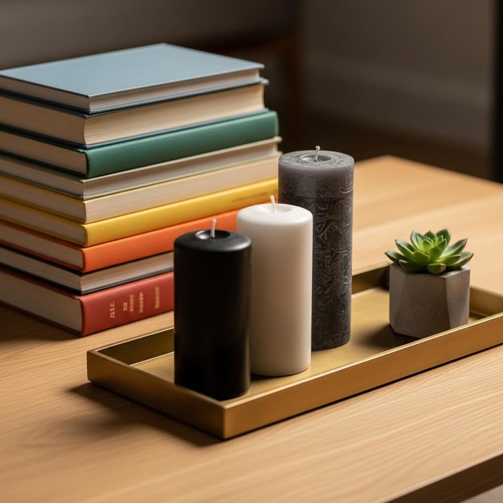
Your final layers—books, candles, trays—are the finishing touches. Group books by color, find candles in your hue, and use trays or objects in complementary metals (like copper for reds/oranges, silver for blues/greens). This level of detail is what makes a room feel finished.
Fun Challenge: Next time you’re shopping, try only looking for accessories in your chosen color family. It simplifies decisions and the result is wildly cohesive.
16. Know When to Add a Hint of Contrast
Okay, hear me out. Sometimes a true monochrome room needs one tiny, microscopic pinch of contrast to make the main color sing. Think black picture frames in an all-white room, dark bronze switch plates in a sage green space, or crisp white trim in a deep charcoal room.
Pro Move: Keep this contrast to hard, structural, or metallic elements. It frames the scheme without introducing a competing color. It’s like a pinch of salt in chocolate chip cookies—you don’t taste it, but it makes everything better.
Your One-Color Wonderland Awaits
See? Monochrome is anything but monotonous. It’s a creative challenge that forces you to think about texture, light, and form in a whole new way.
You’re not limiting yourself; you’re focusing your creativity. So, pick a color that makes your heart happy and start playing with its infinite possibilities. Trust me, your home and your decision making sanity will thank you. Now, go build that beautiful, single-hued sanctuary. You’ve totally got this.